# Tooltip

The Tooltip component offers extra contextual information on hover, focus, or tap, without cluttering the UI. It ensures accessibility and clarity, helping users easily understand functionality or data.

<figure><img src="https://2796820426-files.gitbook.io/~/files/v0/b/gitbook-x-prod.appspot.com/o/spaces%2Fqv3BfwsgDlxxZoSTquMs%2Fuploads%2F79zJAhdjrJImWtPBMtvX%2Fimage.png?alt=media&#x26;token=820233c1-ad0b-4c26-a28b-23615d70ea16" alt=""><figcaption></figcaption></figure>

{% tabs %}
{% tab title="Component React" %}

```
// Sample code

  <Tooltip
    arrow={true}
    className=""
    content={<>And here's some amazing content It's very engaging. Right?<hr /><img alt="here is your logo" src="https://egov-dev-assets.s3.ap-south-1.amazonaws.com/digit.png"/></>}
    description="Lorem ipsum dolor sit amet, consectetur adipiscing elit, sed do eiusmod tempor incididunt "
    header="Header"
    style={{}}
  />
```

{% endtab %}

{% tab title="Component Flutter" %}

```
// Sample code

DigitTooltip(
        tooltipContent:  Text(
          'Hello, Tooltip!',
          style: Theme.of(context).digitTextTheme(context).bodyS.copyWith(color: Theme.of(context).colorTheme.paper.primary),
        ),
        trigger: TooltipTrigger.onHover,
        tooltipPosition: TooltipPosition.topStart,
        child: Container(
          color: Colors.blue,
          padding: const EdgeInsets.all(16),
          child: const Text('Tap me'),
        ),
      ),
```

{% endtab %}

{% tab title="Component Design" %}

{% endtab %}
{% endtabs %}

## Anatomy

***

<figure><img src="https://2796820426-files.gitbook.io/~/files/v0/b/gitbook-x-prod.appspot.com/o/spaces%2Fqv3BfwsgDlxxZoSTquMs%2Fuploads%2FXrX5iMVzhVmiCeZGRuN7%2Fimage.png?alt=media&#x26;token=4df798e6-47f8-4956-8fe4-6db8fe962928" alt=""><figcaption></figcaption></figure>

## Variants

***

<table data-header-hidden><thead><tr><th width="321"></th><th></th></tr></thead><tbody><tr><td><div><figure><img src="https://2796820426-files.gitbook.io/~/files/v0/b/gitbook-x-prod.appspot.com/o/spaces%2Fqv3BfwsgDlxxZoSTquMs%2Fuploads%2FlMhml7ZnT16O9QQIN9X4%2Fimage.png?alt=media&#x26;token=d08eea11-34d0-416b-9d0d-889d9cf9fa1f" alt=""><figcaption></figcaption></figure></div></td><td><p><strong>Default</strong></p><p>This is a clean toggle without any accompanying label or icon. It's compact and ideal for minimal layouts where the switch’s meaning is already clear from context.</p></td></tr><tr><td><div><figure><img src="https://2796820426-files.gitbook.io/~/files/v0/b/gitbook-x-prod.appspot.com/o/spaces%2Fqv3BfwsgDlxxZoSTquMs%2Fuploads%2Fjd8R2vrPqksDer8s0Tue%2Fimage.png?alt=media&#x26;token=2f9fd17c-c567-46e1-a1bd-58948a725a8b" alt=""><figcaption></figcaption></figure></div></td><td><p><strong>With Symbol</strong></p><p>This variant includes a symbol (like "|" for On and "◯" for Off) inside the switch thumb. It enhances visual clarity and is useful when colour alone isn't enough to indicate the switch's state.</p></td></tr></tbody></table>

***

## Properties

|                                                                                                                                                                                                                               |                                                                                                                                                                                                                                                                                            |
| ----------------------------------------------------------------------------------------------------------------------------------------------------------------------------------------------------------------------------- | ------------------------------------------------------------------------------------------------------------------------------------------------------------------------------------------------------------------------------------------------------------------------------------------ |
| <p><strong>With Icon</strong></p><p>An optional icon can be added to the left or right (dismiss/close icon). This enhances usability and improves scanability, especially for chips used in status indicators or filters.</p> | <div><figure><img src="https://2796820426-files.gitbook.io/~/files/v0/b/gitbook-x-prod.appspot.com/o/spaces%2Fqv3BfwsgDlxxZoSTquMs%2Fuploads%2Ft2Ngk39AB9MDoRDEAE7d%2Fimage.png?alt=media&#x26;token=0d4c71de-2ef2-46a3-89b3-194f3c36aab0" alt=""><figcaption></figcaption></figure></div> |

## Property Configuration Table

Each design component offers a range of configurable options. These options are intentionally platform-agnostic, allowing implementations to adapt and tailor them to align with the specific requirements of the chosen framework.

{% tabs %}
{% tab title="React" %}

<table><thead><tr><th width="257">Property</th><th>Value</th><th>Default</th></tr></thead><tbody><tr><td>isLabelFirst</td><td>text</td><td></td></tr><tr><td>label</td><td>text</td><td></td></tr><tr><td>shapeOnOff</td><td>yes/no</td><td>no</td></tr><tr><td>isCheckedInitially</td><td>yes/no</td><td>no</td></tr><tr><td>onToggle</td><td>number</td><td></td></tr><tr><td>className</td><td>yes/no</td><td></td></tr><tr><td>style</td><td>yes/no</td><td>no</td></tr><tr><td>disable</td><td>yes/no</td><td>no</td></tr><tr><td>switchStyle</td><td>yes/no</td><td>no</td></tr></tbody></table>
{% endtab %}

{% tab title="Flutter" %}

<table><thead><tr><th>Property</th><th width="209">Value</th><th>Default</th></tr></thead><tbody><tr><td>child</td><td>Widget</td><td>required</td></tr><tr><td>contentHeading</td><td>String</td><td>-</td></tr><tr><td>contentDescription</td><td>String</td><td>-</td></tr><tr><td>tooltipContent</td><td>Widget</td><td>-</td></tr><tr><td>tooltipPosition</td><td>TooltipPosition</td><td>TooltipPosition.topCenter</td></tr><tr><td>distance</td><td>double</td><td>-</td></tr><tr><td>trigger</td><td>TooltipTrigger</td><td>TooltipTrigger.onHover</td></tr><tr><td>timeout</td><td>Duration</td><td>-</td></tr></tbody></table>
{% endtab %}
{% endtabs %}

***

## Behaviours

|                                                                                                                                                                                                                                                                                            |                                                                                                                                                                                                                                                                                    |
| ------------------------------------------------------------------------------------------------------------------------------------------------------------------------------------------------------------------------------------------------------------------------------------------ | ---------------------------------------------------------------------------------------------------------------------------------------------------------------------------------------------------------------------------------------------------------------------------------- |
| <div><figure><img src="https://2796820426-files.gitbook.io/~/files/v0/b/gitbook-x-prod.appspot.com/o/spaces%2Fqv3BfwsgDlxxZoSTquMs%2Fuploads%2FQ04e50kJzIrzAK9oKNx7%2Fimage.png?alt=media&#x26;token=04386394-3fc2-4971-8fc0-e74e211bd40f" alt=""><figcaption></figcaption></figure></div> | <p><strong>Label</strong></p><p>Use switches to represent binary on/off states. They are ideal for toggling settings or features that require immediate activation or deactivation.</p><p>Avoid using switches to indicate errors. Switches are not designed for error states.</p> |
| <div><figure><img src="https://2796820426-files.gitbook.io/~/files/v0/b/gitbook-x-prod.appspot.com/o/spaces%2Fqv3BfwsgDlxxZoSTquMs%2Fuploads%2F8CGN8Q1EL0jDHMpT2smF%2Fimage.png?alt=media&#x26;token=37c5c74c-e788-4b18-8537-f21209c3255f" alt=""><figcaption></figcaption></figure></div> | <p><strong>Label Alignment</strong></p><p>The placement of the label can be customised to appear left or right of the switch. This helps maintain visual balance depending on layout needs and reading flow.</p>                                                                   |

***

## Usage Guide

***

| <div><figure><img src="https://2796820426-files.gitbook.io/~/files/v0/b/gitbook-x-prod.appspot.com/o/spaces%2Fqv3BfwsgDlxxZoSTquMs%2Fuploads%2F1dYVB9gAUTjB8sacc5J9%2Fimage.png?alt=media&#x26;token=14d852a5-1e80-4c30-9851-d22f4ad86fb1" alt=""><figcaption></figcaption></figure></div> | <p><strong>
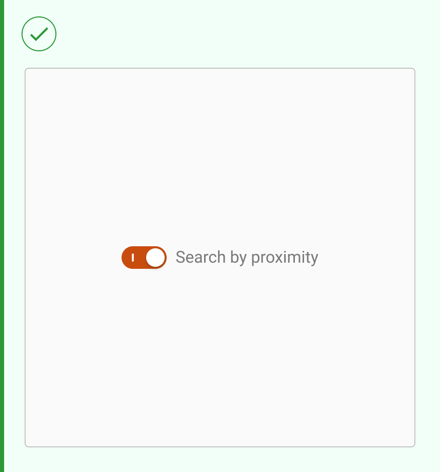
Use dividers for activation states</strong></p><p>Use switches to represent binary on/off states. They are ideal for toggling settings or features that require immediate activation or deactivation.</p><p>Avoid using switches to indicate errors. Switches are not designed for error states.</p> |
| ------------------------------------------------------------------------------------------------------------------------------------------------------------------------------------------------------------------------------------------------------------------------------------------ | --------------------------------------------------------------------------------------------------------------------------------------------------------------------------------------------------------------------------------------------------------------------------------------------------------------- |
| <div><figure><img src="https://2796820426-files.gitbook.io/~/files/v0/b/gitbook-x-prod.appspot.com/o/spaces%2Fqv3BfwsgDlxxZoSTquMs%2Fuploads%2F0dWTDcPYStaxX2ZhiuMa%2Fimage.png?alt=media&#x26;token=157402f6-0089-4ebb-ad3c-22629d5509d2" alt=""><figcaption></figcaption></figure></div> |                                                                                                                                                                                                                                                                                                                 |

## Changelog

***

| Date         | Number  | Notes                                                                                           |
| ------------ | ------- | ----------------------------------------------------------------------------------------------- |
| Dec 15, 2024 | v-0.0.2 | <p>This component is added to the website.<br>This component is now individually versioned.</p> |

## Design Checklist

***

<table data-header-hidden><thead><tr><th width="129" data-type="checkbox"></th><th></th></tr></thead><tbody><tr><td>true</td><td><strong>All interactive states</strong> - Includes all interactive states that are applicable (hover, down, focus, keyboard focus, disabled).</td></tr><tr><td>true</td><td><strong>Accessible use of colours</strong> - Colour is not used as the only visual means of conveying information (WCAG 2.1 1.4.1)</td></tr><tr><td>true</td><td><strong>Accessible contrast for text</strong> - Text has a contrast ratio of at least 4.5:1 for small text and at least 3:1 for large text (WCAG 2.0 1.4.3).</td></tr><tr><td>true</td><td><strong>Accessible contrast for UI components</strong> - Visual information required to identify components and states (except inactive components) has a contrast ratio of at least 3:1 (WCAG 2.1 1.4.11).</td></tr><tr><td>true</td><td><strong>Keyboard interactions</strong> - Includes all interactive states that are applicable (hover, down, focus, keyboard focus, disabled).</td></tr><tr><td>false</td><td><strong>Screen reader accessible</strong> - All content, including headings, labels, and descriptions, is meaningful, concise, contextual and accessible by screen readers.</td></tr><tr><td>true</td><td><strong>Responsive for all breakpoints</strong> - Responsiveness for 3 breakpoints - Mobile, Tablet and Desktop</td></tr><tr><td>true</td><td><strong>Usage guidelines</strong> - Includes a list of dos and don'ts that highlight best practices and common mistakes.</td></tr><tr><td>false</td><td><strong>Content guidelines</strong> - Content standards and usage guidelines for writing and formatting in-product content for the component.</td></tr><tr><td>true</td><td><strong>Defined variants and properties</strong> - Includes relevant variants and properties (style, size, orientation, optional iconography, decorative elements, selection states, error states, etc.)</td></tr><tr><td>true</td><td><strong>Defined behaviours</strong> - Guidelines for keyboard navigation and focus, layout management (including wrapping, truncation, and overflow), animations, and user interactions.</td></tr><tr><td>true</td><td><strong>Design Kit</strong> - Access to the design file for the component in Figma, multiple options, states, colour themes, and platform scales.</td></tr></tbody></table>
