> For the complete documentation index, see [llms.txt](https://docs.digit.org/llms.txt). Markdown versions of documentation pages are available by appending `.md` to page URLs; this page is available as [Markdown](https://docs.digit.org/health/v2.0/design/architecture/low-level-design/services/admin-console/app-configuration.md).

# App Configuration

## Overview

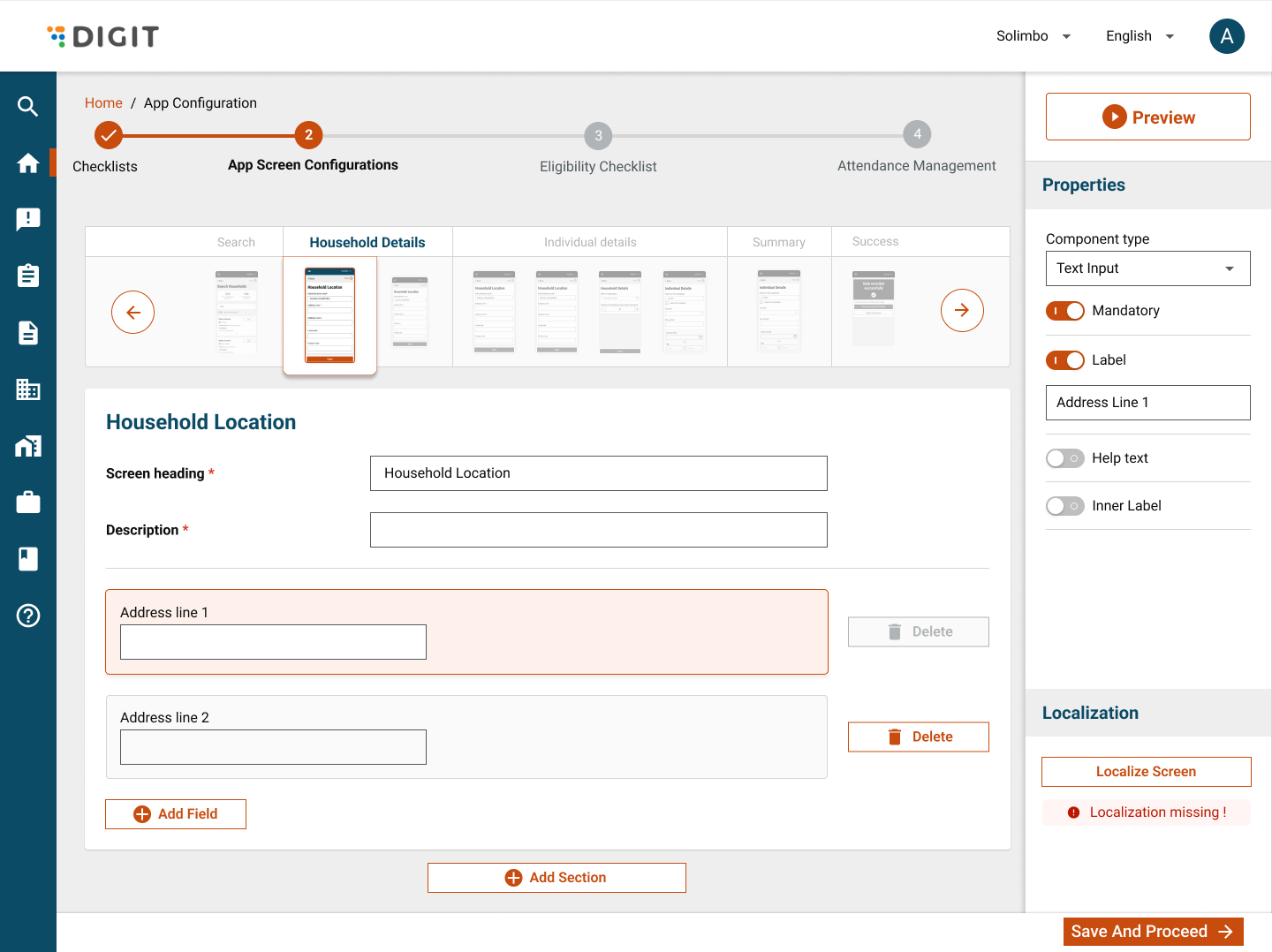
This document outlines the UI design and configuration of screens and components for the application. It includes schema requirements, support for dynamic sections, and the necessary master data to facilitate data flow.

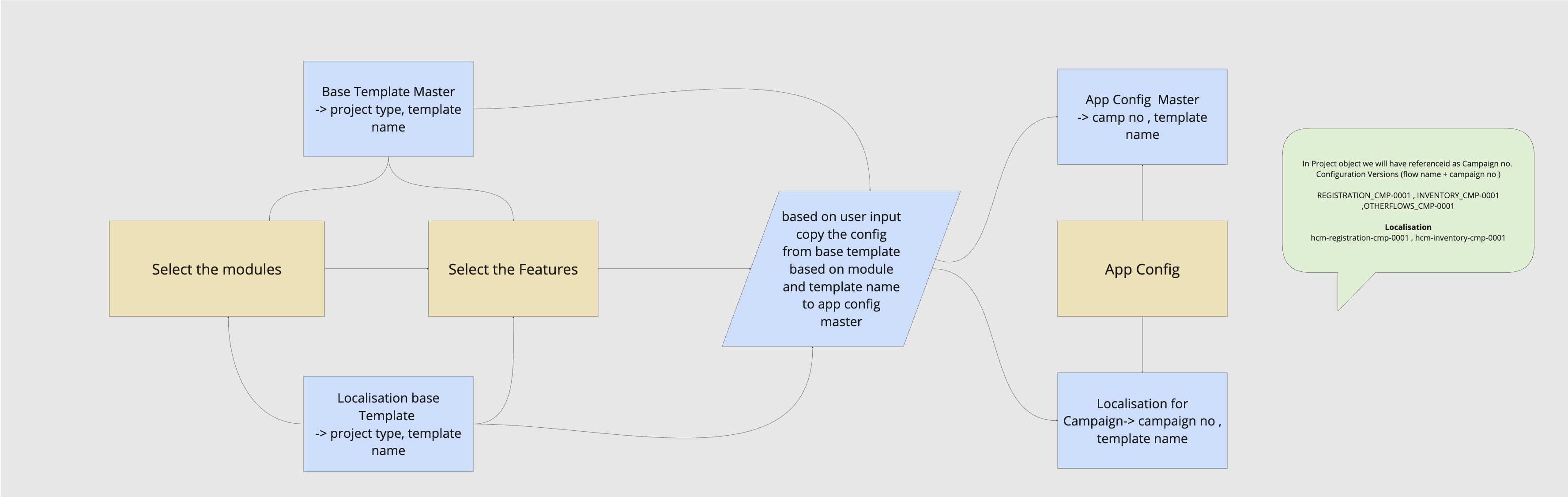
<figure><img src="https://content.gitbook.com/content/mb5VUHEnO0msarLMPz6q/blobs/R0OIKK6nlgips1OKbKac/UI%20Tech%20Designs%20-%20App%20Config%20flow.jpg" alt=""><figcaption><p>App Config - Data Creation flow</p></figcaption></figure>

## Flow Summary

#### 🧾 Campaign Number Generation

* Each **Campaign Number (e.g.,** CMP-2025-05-22-00596&#x31;**)** is unique and derived from the **Campaign object**.
* This campaign number acts as a **reference ID** in the `Project` object once a user logs in.

<figure><img src="https://lh7-rt.googleusercontent.com/docsz/AD_4nXeUQyGg1GC3ZtryWcAxDHdLrpTaRiODnwd-_yomJiuaA1MiheI8AI3mba85xBSzOPznW_nsjG60jJI3PW2SMNLtOsdx4CxW4E3dnQJJRiTByzyNDaGDC235kHULHi-xGK4Cr_tB9g?key=XNmrVJC-eqYscLxLYrbiaeA-" alt=""><figcaption></figcaption></figure>

***

## Template Data

#### Template Base Config

* Present in:\
  `HCM-ADMIN-CONSOLE.TemplateBaseConfig`
* Maintains **default configurations** for each **campaign type**.
* Serves as the **source of truth** to derive actual config data based on module/feature selection.

#### Base Localisation Data

* Module: `hcm-registration-project`
* Maintains **default localisation data** per campaign type.
* Used as a **template** to generate project-specific localisation.

***

## App Configuration

#### 📌 On Module & Feature Selection

When a user selects a specific:

* **Module(s)**
* **Feature(s)**\
  ...then the system:

1. **Reads template** from `TemplateBaseConfig`.
2. **Creates config entries** in:\
   `HCM-ADMIN-CONSOLE.SimpleAppConfiguration`
3. **App config keys** are uniquely identified by:
   * `campaign number`
   * `flow key` (e.g., `REGISTRATION`, `INVENTORY`)

Example:

```
Key: REGISTRATION_CMP-2025-05-22-005961
Key: INVENTORY_CMP-2025-05-22-005961
```

***

### Generate Localisation Data&#x20;

#### 🌍 Based on Flow and Campaign

* Localisation keys are generated using the **flow name** and **campaign number**.

Example:

```
Localisation key: hcm-registration-cmp-2025-05-22-005961
Localisation key: hcm-inventory-cmp-2025-05-22-005961
```

***

#### 🧠 Project Object After Login

When the user logs in and a `Project` is identified:

* `project.referenceId = CMP-2025-05-22-005961`
* Configuration version keys look like:
  * `REGISTRATION_CMP-2025-05-22-005961`
  * `INVENTORY_CMP-2025-05-22-005961`
  * `OTHERFLOWS_CMP-2025-05-22-005961`
* Localisation entries:
  * `hcm-registration-cmp-2025-05-22-005961`
  * `hcm-inventory-cmp-2025-05-22-005961`

### App Config Sequence Diagram

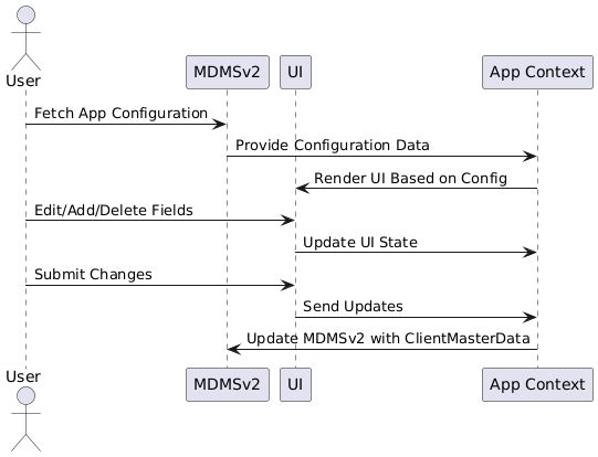
<figure><img src="https://lh7-rt.googleusercontent.com/docsz/AD_4nXfIkalxDEmb6Qn04aAqDRE2Gy2flASYOLyWNqzJ8QglgzQIlHz7mOG2eADSf5PB2L1C0MH3duneYA9gyKvXDOedmbgWgOBLCO4vvIMVIYWbYk33T7EEau6M5C4-7rwHiUvCFQtLBQ?key=XNmrVJC-eqYscLxLYrbiaeA-" alt=""><figcaption><p>Sequence Diagram</p></figcaption></figure>

**Key Points to Consider:**

1. **Schema Integration Based on Project Type**
   * The UI design should incorporate schemas that vary depending on the selected project type.
   * Dynamic rendering of components and fields based on schema definitions.
2. **Enable AddSection Functionality**
   * Provide an option to dynamically add sections to the screen configuration.
   * Ensure sections can be personalised and managed efficiently.
3. **Master Data Requirements**\
   The following master data sets are required to support the UI design and component configurations:
   * **AppScreenConfigTemplate**\
     Predefined templates for application screen configurations based on project type.
   * **AppScreenConfigPersonalized**\
     Personalised configurations for screens, tailored to specific user roles or preferences.
   * **ComponentMetaDataMaster**\
     Metadata defining the components, such as type, properties, and behaviour.
   * **FieldTypeMaster**\
     Master data for supported field types, including their attributes (e.g., input, dropdown, date picker).

{% embed url="<https://pub.dev/packages/registration_delivery>" %}

<figure><img src="https://content.gitbook.com/content/mb5VUHEnO0msarLMPz6q/blobs/gSze1tRA4p1VPhYG3Itx/image.png" alt=""><figcaption></figcaption></figure>

### **Master Data: AppScreenConfigTemplate**

#### **Schema Overview**

The `AppScreenConfigTemplate` defines the configuration and structure of application screens. It supports dynamic field addition, sections, comments, and card-based layouts.

```json
{
  // Array of screens for the application
  "screens": [
    {
      // Unique name for the screen
      "name": "screen1",
      // Parent category of the screen
      "parent": "Registration",
      // Screen headers and descriptions
      "headers": [
        {
          // Header label
          "label": "KJHSJKDHKJH",
          // Type of the header (e.g., header, info, description)
          "type": "header"
        },
        {
          "label": "KJHSJKDHKJH",
          "type": "info"
        },
        {
          "label": "KJHSJKDHKJH",
          "type": "description"
        }
      ],
      // Screen configuration settings
      "config": {
        // Allows adding fields dynamically to the screen
        "enableFieldAddition": true,
        // Allows adding sections dynamically to the screen
        "enableSectionAddition": true,
        // Enables commenting functionality on the screen
        "enableComment": true,
        // Specifies where fields can be added (e.g., body, header, footer)
        "allowFieldsAdditionAt": [
          "body"
        ],
        // Specifies where comments can be added
        "allowCommentsAdditionAt": [
          "body"
        ]
      },
      // Cards within the screen (UI components grouped into cards)
      "cards": [
        {
          // Card header text
          "header": "Header",
          // Card description text
          "description": "Desc",
          // Fields inside the card
          "fields": [
            {
              // Path for binding data in the field
              "jsonPath": "Screen heading",
              // Type of the field (e.g., text, dropdown)
              "type": "text",
              // Label for the field
              "label": "dzdzddadadad",
              // Specifies if the field is mandatory
              "required": true,
              // Indicates if the field is active
              "active": true,
              // Additional metadata for the field
              "metaData": {
                // Field is read-only
                "readOnly": true,
                // Field supports comments
                "isComment": true
              }
            },
            {
              "jsonPath": "Description",
              "type": "text",
              "label": "dzdzddadadad",
              "required": true,
              "active": true,
              "metaData": {
                "isComment": true
              }
            },
            {
              "jsonPath": "Description",
              "type": "text",
              "label": "Address Line 1",
              "required": true,
              "active": true,
              "metaData": {}
            },
            {
              // Unique ID for the field
              "id": "field2",
              // Field type is dropdown
              "type": "dropdown",
              // Label for the dropdown field
              "label": "Beneficiary Status",
              // Additional metadata for dropdown field
              "metaData": {
                // Field is mandatory
                "required": true,
                // Options available for the dropdown
                "options": [
                  {
                    // Label for the dropdown option
                    "label": "Beneficiary Absent",
                    // Value associated with the dropdown option
                    "value": "absent"
                  },
                  {
                    "label": "Delivery Successful",
                    "value": "successful"
                  }
                ]
              }
            }
          ]
        }
      ]
    },
    {
      // Placeholder for additional screen configurations
    }
  ]
}

```

UPDATE

````json
```json
{
  "screens": [
    {
      "name": "HOUSEHOLD_LOCATION",
      "parent": "REGISTRATION",
      "headers": [
        {
          "jsonPath": "SCREEN_HEADING",
          "type": "header",
          "label": "SCREEN_HEADING_LABEL",
          "required": true,
          "active": true,
          "metaData": {
            "fieldType": "text"
          }
        },
        {
          "jsonPath": "DESCRIPTION",
          "type": "description",
          "label": "DESCRIPTION_LABEL",
          "required": true,
          "active": true,
          "metaData": {
            "fieldType": "text"
          }
        }
      ],
      "config": {
        "enableFieldAddition": true,
        "enableSectionAddition": true,
        "enableComment": true,
        "allowFieldsAdditionAt": [
          "body"
        ],
        "allowCommentsAdditionAt": [
          "body"
        ]
      },
      "cards": [
        {
          "header": "HEADER_CODE",
          "description": "DESCRIPTION_CODE",
          "fields": [
            {
              "jsonPath": "ADDRESS_LINE_1",
              "type": "text",
              "label": "ADDRESS_LINE_1_LABEL",
              "required": true,
              "active": true,
              "metaData": {}
            },
            {
              "jsonPath": "ADDRESS_LINE_2",
              "type": "text",
              "label": "ADDRESS_LINE_2_LABEL",
              "required": true,
              "active": true,
              "metaData": {}
            }
          ]
        }
      ]
    }
  ]
}
```
````

### Output Data Structure For App Config

```json
[
  {
    "name": "HouseholdLocation",
    "type": "page",
    "components": [
      {
        "title": "Household Location",
        "description": "Make sure the village name matches the one where you are today.",
        "order": 1,
        "attributes": [
          {
            "name": "administrationArea",
            "type": "field",
            "isEnabled": true,
            "attribute": "textField",
            "readOnly": true,
            "isRequired": false,
            "order": 1,
            "source": "DEFAULT"
          },
          {
            "name": "accuracy",
            "isEnabled": true,
            "readOnly": true,
            "attribute": "textField",
            "isRequired": true,
            "order": 2
          },
          {
            "name": "addressLine1",
            "isEnabled": true,
            "readOnly": false,
            "attribute": "textField",
            "isRequired": false,
            "validation": [
              {
                "pattern": "^\\d+$",
                "key": "onlyDigits",
                "errorMessage": "Digits only"
              }
            ],
            "order": 1
          },
          {
            "name": "postalCode",
            "isEnabled": true,
            "readOnly": false,
            "attribute": "textField",
            "isRequired": false,
            "order": 1
          },
          {
            "name": "TextField",
            "type": "additionalField",
            "label": "TextField",
            "attribute": "textField",
            "formDataType": "String",
            "isEnabled": true,
            "readOnly": false,
            "isRequired": false,
            "keyboardType": "number",
            "validation": [
              {
                "pattern": "^\\d+$",
                "key": "onlyDigits",
                "errorMessage": "Digits only"
              }
            ],
            "order": 1
          },
          {
            "name": "SelectionBox",
            "type": "additionalField",
            "label": "SelectionBox",
            "attribute": "selectionbox",
            "formDataType": "List<String>",
            "menuItems": [
              "a",
              "b",
              "c",
              "d"
            ],
            "allowMultipleSelection": true,
            "isEnabled": true,
            "readOnly": false,
            "isRequired": false,
            "order": 2
          },
          {
            "name": "dateForm",
            "type": "additionalField",
            "label": "dateForm",
            "attribute": "dateFormPicker",
            "formDataType": "DateTime",
            "isEnabled": true,
            "readOnly": false,
            "isRequired": false,
            "order": 5
          },
          {
            "name": "DropDown",
            "type": "additionalField",
            "label": "DropDown",
            "attribute": "dropdown",
            "formDataType": "String",
            "menuItems": [
              "a",
              "b"
            ],
            "isEnabled": true,
            "readOnly": false,
            "isRequired": false,
            "order": 3
          },
          {
            "name": "dobPicker",
            "type": "additionalField",
            "label": "dobPicker",
            "attribute": "dobPicker",
            "formDataType": "DateTime",
            "isEnabled": true,
            "readOnly": false,
            "isRequired": false,
            "order": 4
          },
          {
            "name": "integerFormPicker",
            "type": "additionalField",
            "label": "integerFormPicker",
            "attribute": "integerFormPicker",
            "formDataType": "int",
            "initialValue": 0,
            "minimum": 0,
            "maximum": 10,
            "isEnabled": true,
            "readOnly": false,
            "isRequired": false,
            "order": 6
          }
        ]
      }
    ]
  }
]
```

### Field Type Master Data

This provides the configuration and metadata for various input field types used in the application. Each field type is mapped to a specific `appType` and includes metadata such as data types, validation rules, and other properties.

```json
{
  "fieldType": [
    {
      "type": "textInput",
      "appType": "textField",
      "metadata": {
        "formDataType": "String",
        "validation": [
          {
            "pattern": "^\\d+$",
            "key": "onlyDigits",
            "errorMessage": "Digits only"
          }
        ]
      }
    },
    {
      "type": "number",
      "appType": "textField",
      "metadata": {
        "formDataType": "String",
        "keyboardType": "number",
        "validation": [
          {
            "pattern": "^\\d+$",
            "key": "onlyDigits",
            "errorMessage": "Digits only"
          }
        ]
      }
    },
    {
      "type": "dropDown",
      "appType": "dropdown",
      "metadata": {
        "formDataType": "String",
      },
     "attributeToRename": {
        "from": "options", 
        "to": "menuItems" // Rename "options" to "menuItems" when restructuring
        "optionalFunction": null
      }
      "attributeToDelete": [],
      }
    {
      "type": "checkbox",
      "appType": "selectionbox",
      "metadata": {
        "formDataType": "List<String>",
        "allowMultipleSelection": true,
      },
      "fieldRenameMap": {
        "options": "menuItems" // Rename "options" to "menuItems" when restructuring
      }
    },
    {
      "type": "counter",
      "appType": "integerFormPicker",
      "metadata": {
        "formDataType": "int",
        "initialValue": 0,
        "minimum": 0,
        "maximum": 10
      }
    },
    {
      "type": "datePicker",
      "appType": "dobPicker",
      "metadata": {
        "formDataType": "DateTime"
      }
    },
    {
      "type": "dobPicker",
      "appType": "dateFormPicker",
      "metadata": {
        "formDataType": "DateTime"
      }
    }
  ]
}
```

### Drawer Master Data

The **Drawer Master Data** defines the configuration for the list of fields to be displayed in the drawer. Each field includes a `label` for identification and a `fieldType` that determines the type of input control to be rendered in the UI.

```json
{
  "drawerData": [
    {
      "label": "componentType",
      "fieldType": "dropdown",
      "defaultValue": false,
      "visibilityEnabledFor": []
    },
    {
      "label": "Mandatory",
      "fieldType": "toggle",
      "defaultValue": false,
      "visibilityEnabledFor": ["textField", "dropDown"]
    },
    {
      "label": "label",
      "fieldType": "toggle",
      "defaultValue": false,
      "visibilityEnabledFor": ["textField", "dropDown"]
    },
    {
      "label": "helpText",
      "fieldType": "toggle",
      "defaultValue": false,
      "visibilityEnabledFor":[]
    },
    {
      "label": "innerLabel",
      "fieldType": "toggle",
      "defaultValue": false,
      "visibilityEnabledFor": []
    }
  ]
}
```

### Localisation Master data

<pre class="language-json"><code class="lang-json"><strong>{
</strong>  "LocalisationData": {
    "screen": "appScreenConfig"
    "LocalisationModule":"configure-app",
    "moduleVersion": "3",
    "minModuleVersion": "1",
    "fields": [
      {
        "fieldType": "dropdown",
        "localisableProperties": ["label", "options", "placeholder"]
      },
      {
        "fieldType": "toggle",
        "applicableFieldTypes": ["textField", "dropDown"]
      },
      {
        "fieldType": "toggle",
        "applicableFieldTypes": ["textField", "dropDown"]
      },
      {
        "fieldType": "toggle",
        "applicableFieldTypes": []
      }
    ]
  }
}
</code></pre>

### **Flow Overview**&#x20;

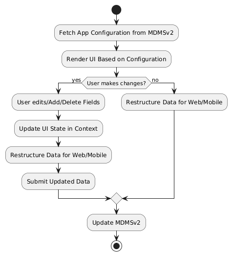
1. **Fetching the App Configuration from MDMSv2:**

   * **Step Description:** The app configuration master data is fetched from the **MDMSv2** (Master Data Management System version 2). This data includes the settings, components, field types, and other configurations that dictate the structure and behaviour of the app’s screens and components.
   * **Flow Detail:**
     * The data is fetched asynchronously via an API call to the MDMSv2.
     * Once the data is fetched, it is stored in the application’s global state using **React’s `useContext`**. This ensures the data is accessible across various components throughout the app.
     * The data might look like:
       * Screen configurations (e.g., component layout, form field types).
       * Master data for field types, component metadata, drawer configurations, etc.
   * **Considerations:**
     * Ensure that proper error handling is in place if the API call fails (e.g., retry logic or fallback UI).
     * The context should be memoised or optimised for performance if the app grows large.

2. **User Interactions (Editing, Adding, Deleting Components):**

* **Step Description:** Once the data is loaded and the UI is rendered based on the fetched configuration, users can interact with the UI by editing, adding, or deleting fields and components.
* **Flow Detail:**
  * **Editing:** Users can modify the existing field values or configurations. For example, changing field labels, modifying validation rules, or adjusting layout properties.
  * **Adding:** Users can add new components, fields, or sections to the form. The UI should dynamically update to accommodate new fields or components.
  * **Deleting:** Users can delete specific components, fields, or entire sections, and the UI should reflect these changes instantly.
  * The updates made by the user are stored in the local state (managed by React’s `useState` or within the `useContext`).
* **Considerations:**
  * The system must handle edge cases, such as removing fields that are required or have dependencies.
  * Ensure that updates are validated locally before sending them back to MDMSv2, to prevent inconsistencies.

***

3. **Restructuring Data for Web or Mobile Outputs:**
   * **Step Description:** After the user makes changes, the data must be restructured based on the target platform (e.g., web or mobile). This restructuring ensures that the configuration is correctly formatted to match the specifications required by the platform.
   * **Flow Detail:**
     * Once the data is updated, it is transformed according to the specific platform’s output format. For example:
       * For web applications, the configuration might need to be structured in a way that fits the web component framework (e.g., React).
       * For mobile applications, it may need to follow mobile-specific guidelines (e.g., using mobile UI components or formats).
     * The restructuring process may involve:
       * Converting configuration fields to fit the layout constraints of mobile screens (e.g., adjusting padding, margins).
       * Changing input types or validations for mobile responsiveness.
       * Adapting field types and labels based on the platform (e.g., dropdowns might be replaced with modals on mobile).
   * **Considerations:**
     * This step may require conditional logic to determine which platform the configuration is being prepared for.
     * No data must be lost during the restructuring process, so careful testing is needed.
4. **Updating MDMSv2 (Client Master Data Structure):**
   * **Step Description:** After the changes are made and the data has been restructured for the appropriate platform, the final updated configuration needs to be sent back to **MDMSv2**. This update is stored as the **ClientMasterData** structure.
   * **Flow Detail:**
     * The modified data is packaged into a **ClientMasterData** structure, which conforms to the MDMSv2 schema.
     * An API call is made to send the updated data back to MDMSv2, where it is stored.
     * The **ClientMasterData** structure typically includes:
       * Updated configuration for screens, components, fields, and other UI elements.
       * Any changes to validation rules, field types, or component properties.
     * The system should notify the user once the update has been successfully pushed to MDMSv2, ideally with a confirmation message or toast notification.
   * **Considerations:**
     * Ensure data integrity is maintained during the update process.
     * The system should handle error scenarios (e.g., failed updates, validation errors) and provide appropriate feedback to users.
     * Implementing a **versioning system** for the configuration data could help manage updates and rollback scenarios, ensuring consistency over time.

## Sequence Diagram

<figure><img src="https://content.gitbook.com/content/mb5VUHEnO0msarLMPz6q/blobs/GUzVxZkZ9zhTQ0IMv9JU/image.png" alt=""><figcaption></figcaption></figure>

## Flow Diagram

<figure><img src="https://content.gitbook.com/content/mb5VUHEnO0msarLMPz6q/blobs/Z62hDCJ3FusJBCVhGJyL/image.png" alt=""><figcaption></figcaption></figure>

## App Integration

Once the config is created, if it is directly for MDMS v2, we will enrich it with additional metadata and send it directly to MDMS v2.

If code generation is required based on the alternative approach, we will convert the config into code changes and push it to GitHub for app generation.


---

# Agent Instructions
This documentation is published with GitBook. GitBook is the documentation platform designed so that both humans and AI agents can read, navigate, and reason over technical content effectively. Learn more at gitbook.com.

## Querying This Documentation
If you need additional information that is not directly available in this page, you can query the documentation dynamically by asking a question.

Perform an HTTP GET request on the current page URL with the `ask` query parameter, and the optional `goal` query parameter:

```
GET https://docs.digit.org/health/v2.0/design/architecture/low-level-design/services/admin-console/app-configuration.md?ask=<question>&goal=<endgoal>
```

`ask` is the immediate question: it should be specific, self-contained, and written in natural language.
`goal` is optional and describes the broader end goal you are ultimately trying to accomplish on behalf of the user. GitBook uses it to tailor the answer towards what is most useful for that goal.

The response will contain a direct answer to the question and relevant excerpts and sources from the documentation.

Use this mechanism when the answer is not explicitly present in the current page, you need clarification or additional context, or you want to retrieve related documentation sections.