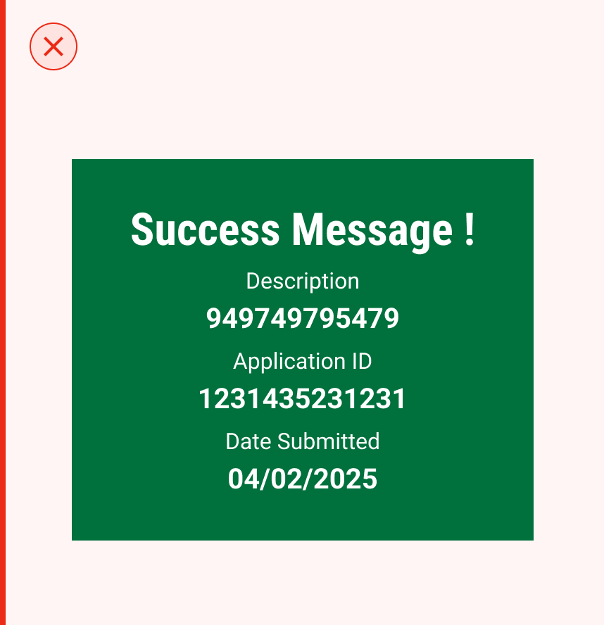


 | Success Panel Displays a positive outcome using a green background and a check icon. Used to confirm actions such as form submissions or successful operations. |
 | Error Panel Indicates failure with a red background and alert icon. Helps users identify and resolve problems quickly. |
| Animation The panel’s success or failure animation plays smoothly. |  |
| Description Each panel contains a clear description with optional supporting information (e.g., reference ID or code). |  |
| Property | Value | Default |
|---|---|---|
| className | text | - |
| message | text | no |
| type | yes/no | no |
| info | yes/no | - |
| response | number | - |
| customIcon | yes/no | - |
| iconFill | yes/no | no |
| style | yes/no | no |
| multipleResponses | yes/no | no |
| animationProps | number | no |
| showAsSvg | yes/no | no |
| Property | Value | Default |
|---|---|---|
| type | PanelType | required |
| title | String | required |
| description | List<String> | - |
| animate | bool | false |
| repeat | bool | false |
| panelThemeData | PanelThemeData | - |
| Mousedown State When a user presses down on the input field to begin entering text, the field responds by slightly darkening its background colour. This immediate visual feedback reinforces the interactivity of the component, signalling to the user that the input field is active and ready to receive input. |  |

Dynamic Positioning
The Panel can adapt its position dynamically based on the device or screen size, ensuring visibility without obstructing critical UI elements.
| *** ## Usage Guide *** |
Use clear text and an icon to show the state
Use clear, concise text with relevant icons to indicate success or error states, ensuring users quickly understand the message. Avoid using excessive or unnecessary information that clutters the panel, making it harder to read at a glance.
| | ------------------------------------------------------------------------------------------------------------------------------------------------------------------------------------------------------------------------------------------------------------------------------------------ | --------------------------------------------------------------------------------------------------------------------------------------------------------------------------------------------------------------------------------------------------------------------------------------------------------------------------- | |
This component is added to the website.
This component is now individually versioned.
| true | All interactive states - Includes all interactive states that are applicable (hover, down, focus, keyboard focus, disabled). |
| true | Accessible use of colours - Colour is not used as the only visual means of conveying information (WCAG 2.1 1.4.1) |
| true | Accessible contrast for text - Text has a contrast ratio of at least 4.5:1 for small text and at least 3:1 for large text (WCAG 2.0 1.4.3). |
| true | Accessible contrast for UI components - Visual information required to identify components and states (except inactive components) has a contrast ratio of at least 3:1 (WCAG 2.1 1.4.11). |
| true | Keyboard interactions - Includes all interactive states that are applicable (hover, down, focus, keyboard focus, disabled). |
| false | Screen reader accessible - All content, including headings, labels, and descriptions, is meaningful, concise, contextual and accessible by screen readers. |
| true | Responsive for all breakpoints - Responsiveness for 3 breakpoints - Mobile, Tablet and Desktop |
| true | Usage guidelines - Includes a list of dos and don'ts that highlight best practices and common mistakes. |
| false | Content guidelines - Content standards and usage guidelines for writing and formatting in-product content for the component. |
| true | Defined variants and properties - Includes relevant variants and properties (style, size, orientation, optional iconography, decorative elements, selection states, error states, etc.) |
| true | Defined behaviours - Guidelines for keyboard navigation and focus, layout management (including wrapping, truncation, and overflow), animations, and user interactions. |
| true | Design Kit - Access to the design file for the component in Figma, multiple options, states, colour themes, and platform scales. |