Loading...
Loading...
Loading...
Loading...
Loading...
Loading...
Loading...
Loading...
Loading...
Loading...
Loading...
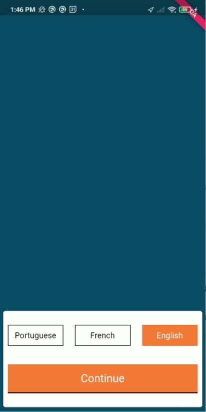
When the user opens the application, it asks them to first select the language. The selected language is highlighted in orange colour.
On this page, the following actions can be performed:
A user can switch the language.
A user can click on 'Continue' to navigate to the login screen.
File Path
Language Selection Screen
Language Selection Card :
Here are the articles in this section:
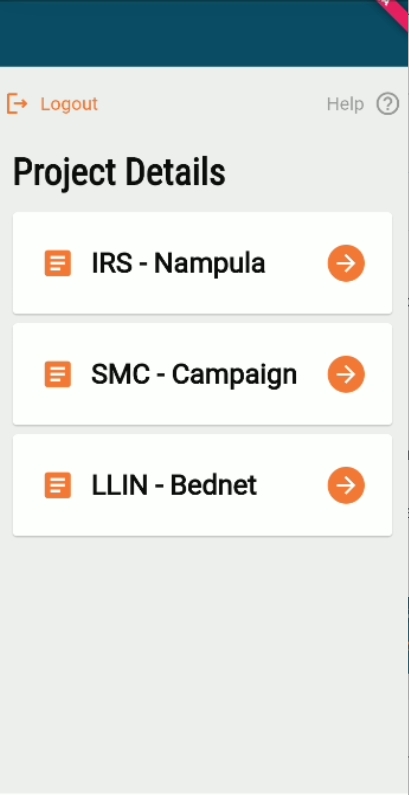
After a user logs into the HCM app, the project selection screen displays all the projects assigned to the user.
On this page, the following actions can be performed:
A user has to select one project.
After selecting a project, the system downloads the data for the selected project only.
After every login action, the system will automatically syncs the data with the system.
Since the user will log in only at the start of the day and before going into the field, there must be stable internet connectivity for the device to perform this process.
A “Sync in Progress” window appears on the screen and the user cannot perform any other action until the process is complete.
/project/staff/v1/_search
POST
/project/v1/_search
POST
Project Selection Screen
This enables a user to manage stocks, besides facilitating stock reconciliation.
On this page, the following actions can be performed:
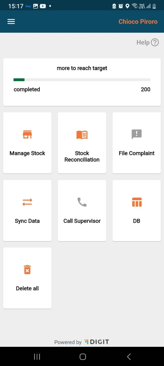
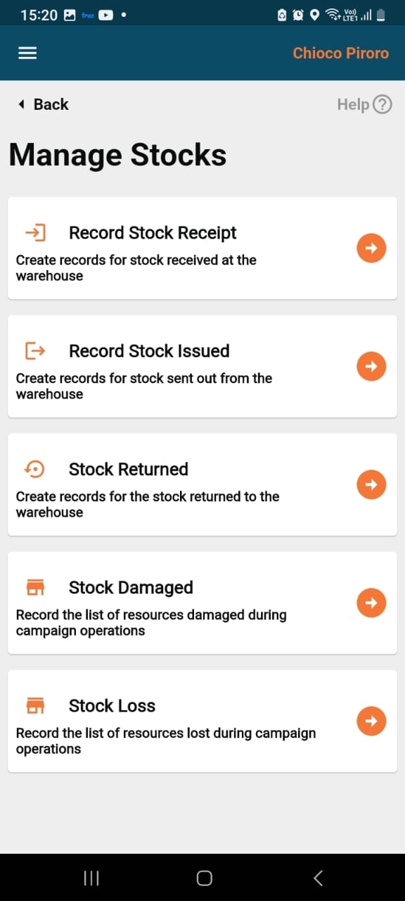
After a successful login as a warehouse manager, a user lands on the home screen which consists of "Manage Stock", and "Stock Reconciliation".-
This screen consists of the following types of transactions that take place for the the inventory:
Stock Receipt
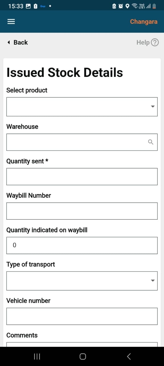
Stock Issued
Stock Returned
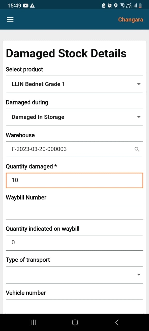
Stock Damaged
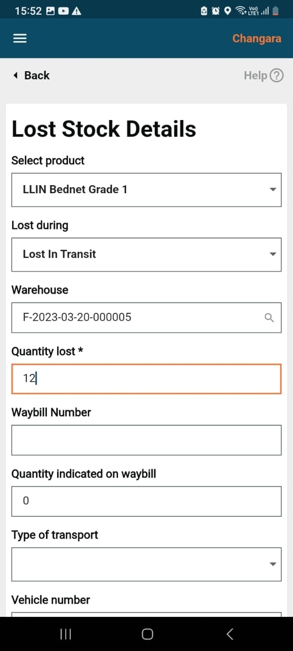
Stock Loss
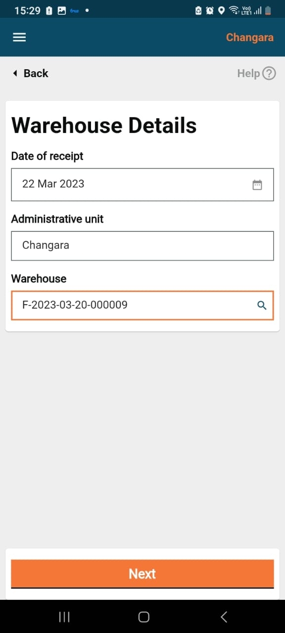
When a user clicks on record stock receipt, the warehouse details screen will appear.
The latitude/longitude captures the geo-location of the warehouse which can be fetched with the help of the location icon within the field.
Clicking on the next button will navigate the user to the "Received Stock" details screen.
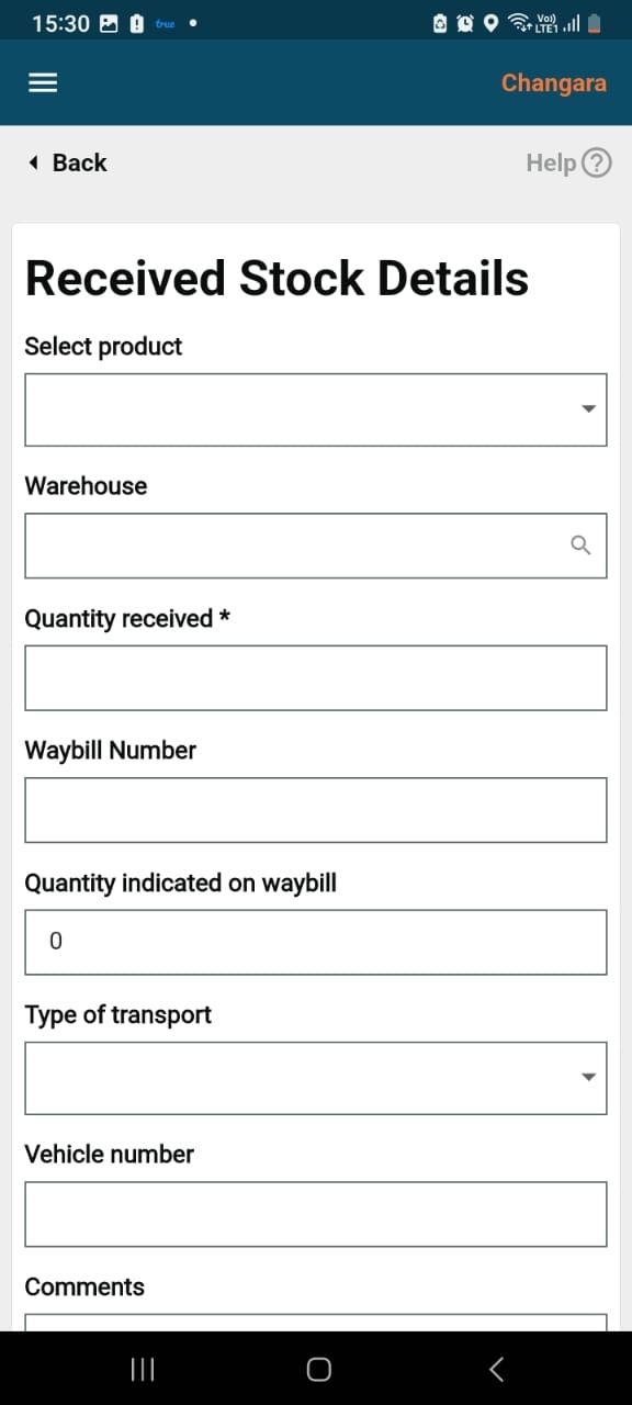
The "Receipt Stock Details" form has some mandatory fields: product, received from warehouse, and quantity received.
The optional fields include waybill number, quantity indicated on waybill, transport type, vehicle number, and comments.
Clicking on the submit button will take the user to the success page.
This screen captures the mandatory fields: Product, Issued to warehouse, and the quantity.
The optional fields include waybill number, quantity indicated on waybill, transport type, vehicle number and comments.
Clicking on the submit button will go to the success page.
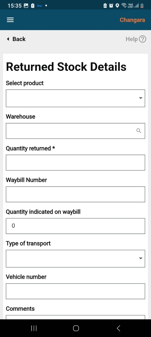
This screen captures the mandatory fields: Product, returned to warehouse, and quantity returned.
The optional fields are waybill number, quantity indicated on waybill, transport type, vehicle number, and comments.
Clicking on the submit button will take the user to the success page.
This screen captures the mandatory fields: Product, damaged during, received from, and quantity damaged.
The optional fields include waybill number, quantity indicated on waybill, transport type, vehicle number, and comments.
Clicking on the submit button will take he user to the success page.
This screen captures the mandatory fields: Product, lost during, received from, and quantity lost.
The optional fields are wWaybill Number, quantity indicated on waybill, transport type, vehicle number, and comments.
Clicking on the submit button will take the user to the success page.
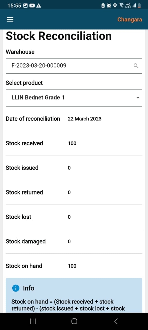
When the user clicks on the stock reconciliation button on the home screen, he/she is navigated to this screen where he/she needs to verify whether the physical count and calculated stock values are the same or not.
In the select product field, the user needs to select a product from the dropdown.
There are warehouse name and administrative area fields as well, all of which are mandatory.
/stock/v1/bulk/_create
POST
/stock/v1/bulk/_update
POST
/stock/v1/bulk/_search
POST
/stock/reconciliation/v1/bulk/_create
POST
/stock/reconciliation/v1/_search
POST
Click for details.
This document is a step-by-step promotion guide to setup/promote the Health Campaign Management (HCM) Dashboard to higher environments. The guide can be used by implementation teams and other external teams to set up the product.
List of core digit services used:
The HCM Dashboard consumes the same core services that are used by HCM Platform services.
Refer to this for the list of core services to be deployed for the HCM dashboard.
The following image of the Dashboard analytics service is required for the HCM dashboard:
This section will detail the promotion guide steps for the HCM Dashboard.
Tags created for the release artefacts:
The HCM Dashboard includes UI enhancements that are part of the image mentioned above. The stylesheet and the global config used by the UI are as follows:
Deploying the above image to the target environment will include the HCM dashboard for eligible users.
This module helps in marking the attendance of the field users (referred to as attendees), who are supposed to work on the campaign till the campaign is live.
ROLE: DISTRICT_SUPERVISOR
This module has 3 associated screens:
Manage Attendance
Date and Session Selection
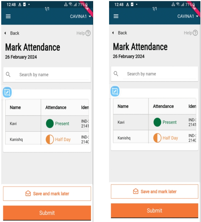
Mark Attendance
Once the supervisor clicks on the “Manage Attendance” button, the supervisor is taken to the attendance registers mapped to them. The attendance registers are to be created manually, by taking a combination of the project, and the supervisor or staff member is mapped to it.
.
Fetch all attendance logs for the register.
Based on the sessions configured for the register, check for the logs where the entry time and the exit time are equal to the start and the end time of the session.
For individuals who do not have logs that are the same as the start and the end time will be by default marked as absent if any of the individuals' logs is present for the register.
//generateDateList will return the map of completed attendance Dates.
list = generateDateList(
e.attendanceRegister.startDate!,
e.attendanceRegister.endDate!,
registerCompletedLogs ?? [],
e.attendanceRegister.additionalDetails?["sessions"] != 2,
);
var completedDaysCount =
e.attendanceRegister.additionalDetails?["sessions"] == 2
? list.length ~/ 2 //for registers with 2 sessions
: list.length; ////for registers with single session
The date selection range commences from the start date of the attendance register and extends to the end date of the register or today's date if today falls before the end date of the register.
If the attendance for a past day is already submitted, then the CTA must change to view attendance from mark attendance.
Upon selecting the attendance register, a list of completed dates is generated. We iterate over the dates from the start date to the current date, checking for any missing dates in the list to identify missed attendance dates.
The trainees or supervisors should be able to mark the attendance daily twice (one for entry and exit) against each register (default configuration for sessions).
Supervisors can mark half-day, full-day, and absent - Definitions of the statuses are as follows:
Not marked: Default status in the register. This must be the status when the user has not taken any action on the line item.
Present: Tapping once must change the "Not Marked" status to 'Present' (Not Marked —> Present).
Absent: Tapping twice must change the 'Present' status to 'Absent' (Not Marked —> Present—->Absent).
Half-day (Only if config requires attendance once a day): Tapping thrice must change the absent status to half-day (Not Marked —> Present—->Absent—-> Half Day).
Save and Mark Later: If the user marks attendance for 10 out of 50 people, and clicks on save and mark later, the supervisor should be able to reopen the given attendance register while it is active and see the status of the attendance marked as per the last time they updated the screen.
Submit: If the user marks attendance for 10 out of 50 people, and clicks on submit, an error message is shown to mark attendance for all staff. After marking attendance for all staff, and clicking on submit, the supervisor navigates to the attendance recorded acknowledgement screen.
For the registers, for which attendance is submitted, we have a flag upload_to_server for each log. If this is true, then the attendance for the register is submitted.
As we cannot send absent logs to the server, we filter the present and half-day logs, and create the oplog for those.
For each marking, two log objects are created for sending to the server: ENTRY and EXIT as shown below:
[{
"registerId": registerId,
"individualId": attendeeList.individualId,
"time": entryTime,
"type": "ENTRY",
"status": "ACTIVE",
"tenantId": tenantId,
"documentIds": []
},
{
"registerId": registerId,
"individualId": attendeeList.individualId,
"time": exitTime,
"type": "EXIT",
"status": "ACTIVE",
"tenantId": tenantId,
"documentIds": []
}]
Digit Project Cell:
Digit Elevated Button:
Toaster:
Refer to this to promote the backend services and configurations.
Stylesheet:
Global config:
Dashboard chart configurations
dashboard-v1.1.0
Dashboard analytics service
dashboard-v1.1.0
MDMS
dashboard-v1.1.0
DIGIT UI
HCM-v1.5
DIGIT UI
digit-ui:health_v1.1.0-91a6f61fc1-375
DIGIT micro UI with enhancements specific for the health Dashboard.
/health-attendance/v1/_search
POST
/individual/v1/_search
POST
/health-attendance/log/v1/_search
POST
/health-attendance/log/v1/_create
POST
1.0
10/05/2023
This version covers the HCM Dashboard promotion guide.
Dashboard analytics service
dashboard-analytics:dashboard-v1.1.0-2ad7482dbd-32
The core dashboard analytics service with specific enhancements have been added for the HCM Dashboard.
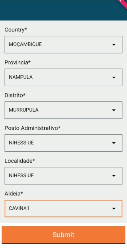
After a supervisor logs into the HCM web app, the project services will be invoked to set the locations that are tagged to the user.
Based on the details of the user logged in to the dashboard, the project-staff-search is invoked to get the projects associated with the user.
A Project-Search is then invoked to get the complete project-details which includes campaign start and end dates, boundary information, etc.
The MDMS API is invoked to get more details about the project based on “projectType”.
The egov-Location service is invoked to get the boundary information based on boundaryCode that was obtained from the project details.
A supervisor can navigate to their corresponding dashboards (national/ provincial/district) using the following URLs:
- https://health-demo.digit.org/digit-ui/employee/dss/dashboard/national-health-dashboard
- https://health-demo.digit.org/digit-ui/employee/dss/dashboard/district-health-dashboard
On the dashboards, users can only view the information which was synced corresponding to the projects they are associated with. As more devices sync, the dashboards will be updated with the latest synced data.
End point
Request Method
Request Payload
/project/staff/v1/_search
POST
{
"ProjectStaff": {
"staffId": "loggedInUserId"
},
"RequestInfo": {
"authToken": "string",
}
}
/project/v1/_search
POST
{
"RequestInfo": {
"authToken": "string"
},
"Projects": [
{ "id":"projectId",
"tenantId": "string"
}
]
}
/egov-mdms-service/v1/_search?tenantId=default
POST
{
"MdmsCriteria": {
"tenantId": "default",
"moduleDetails": [
{
"moduleName": "HCM-PROJECT-TYPES",
"masterDetails": [
{
"name": "projectTypes"
}
]
}
]
},
"RequestInfo": {
"authToken": "string"
}
}
/egov-location/location/v11/boundarys/_search?hierarchyTypeCode=ADMIN&tenantId=default&codes=<boundarycode>&boundaryType=<boundaryType>
POST
{
"RequestInfo": {
"authToken": "string"
}
}
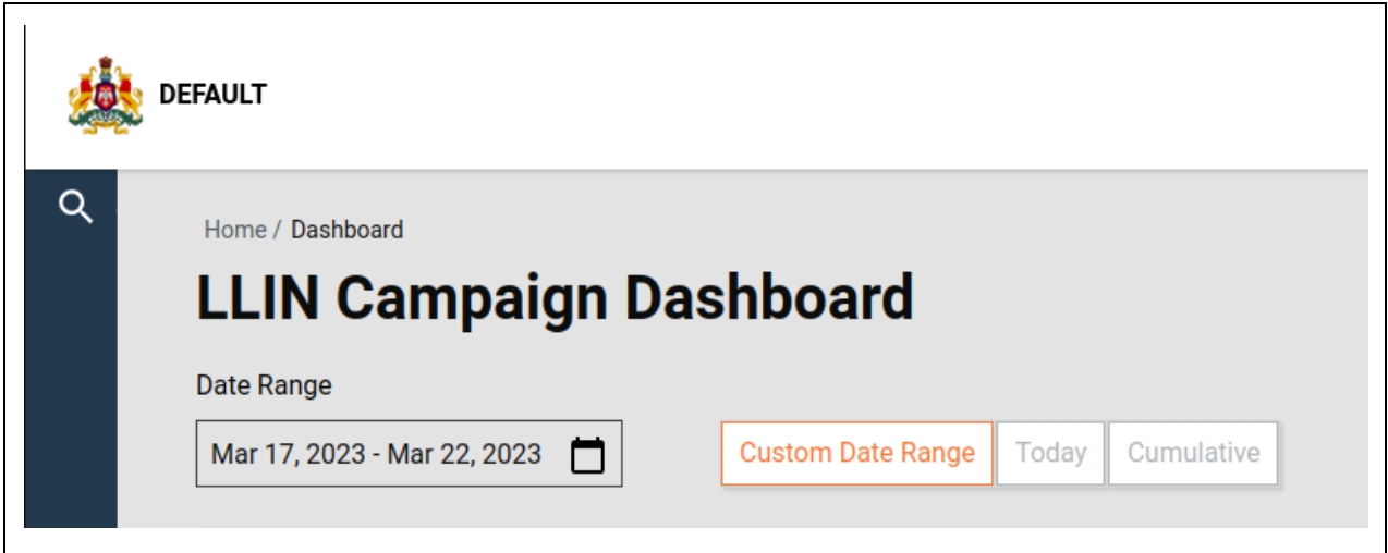
The date range can be controlled with the following three options provided to the user:
Custom Date Range
Today
Cumulative
Custom Date Range: The user will be able to choose any date range between the campaign start date and the current day
Today: The date picker will be disabled and the date range will be set to the current day.
Cumulative: The date picker will be disabled and the date range will be set for the duration of the campaign start date to the current day.
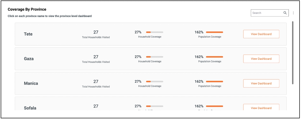
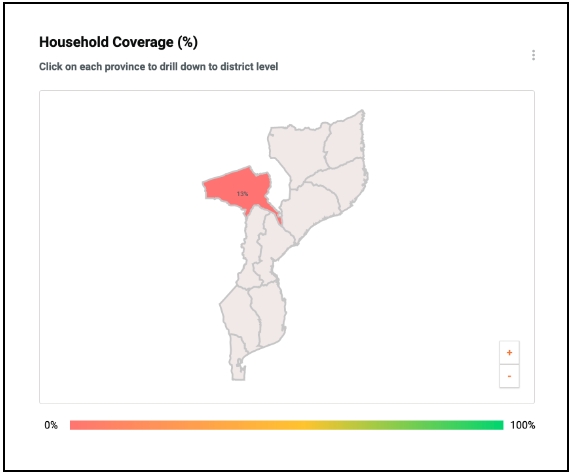
Heatmaps display the boundary-based coverage for a campaign using a relative colours gradient scale. The colour of a boundary changes based on the coverage percentage value, and the user is allowed to click on a higher level boundary (state) to drilldown to the lower level regions (state → district).
The chart component uses a react-simple-maps library to render the geographical map of the target region.
The component expects a GeoJSON file which is stored as a static file in the MDMS.
The component fetches the aggregated data from the analytics service and plots it on the geographical map to show the coverage achieved by the boundaries.
The GeoJSON files are loaded to s3 assets.
These file references are stored in MDMS under the “map-config” module and "GeoJsonMapping" master:
https://github.com/egovernments/egov-mdms-data/blob/UNIFIED-QA/data/mz/map-config/geo-json-mapping
End point
Request method
Request payload
/mdms-v2/v1/_search?tenantId=mz
POST
{
"MdmsCriteria": {
"tenantId": "string",
"moduleDetails": [
{
"moduleName": "map-config",
"masterDetails": [
{
"name": "GeoJsonMapping"
}
]
}
]
},
"RequestInfo": {
"authToken": "string"
}
}
/dashboard-analytics/dashboard/getChartV2
POST
{
"aggregationRequestDto": {
"visualizationType": "TABLE",
"visualizationCode": "string",
"queryType": "",
"filters": {},
"moduleLevel": "",
"aggregationFactors": null
},
"headers": {
"tenantId": "string"
},
"RequestInfo": {
"authToken": "string"
}
}
Stacked collection displays the metric data in a columnar fashion on the national dashboard (landing page). It grows vertically based on the length of the metric charts that are configured as part of the collection.
Setting the vizType field to “stacked-collection” will enable this chart. A stacked view is enabled only on the landing page (Example: National dashboard).
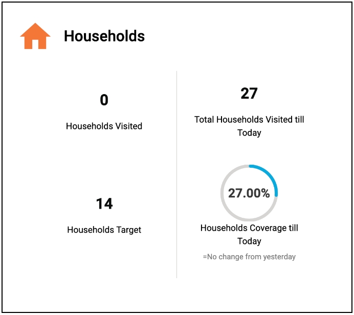
A collection of metrics which are displayed in a grid-based fashion. If the “valueType” of a metric is ‘percentage’, then this chart will display a circular progressbar for the metric. This is a vizType which accepts one or more ‘metric’ charts as children.
Setting the vizType field to "stacked-collection" will enable this chart on the dashboard pages (Example: Provincial dashboard).
A list of cards inside a container that grows vertically. The container displays a vertical scrollbar if the number of items in the container is more than the height of the container.
Setting the vizType field to "stacked-table" will enable this chart on the landing page (Example: National dashboard). The vizType accepts a ‘table’ chart as its child and uses the table chart data to render the list of cards on the page.
A card with a horizontal list of items displayed on top of the dashboard. It displays the items in a single row with the labels on top and the value at the bottom.
This chart can be enabled by setting the “vizType” to “bannercard”. This visualisation accepts a ‘table’ chart as its child, and the table chart’s response should include only a single row.
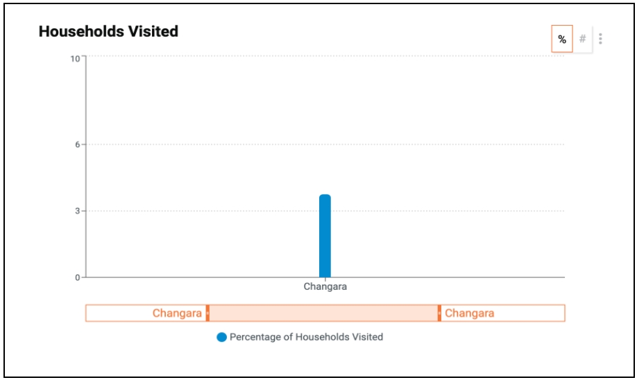
The brush component enabled for bar charts will let the users zoom and pan a bar chart without losing view of any data item. This enables the chart to have any number of bars, and the user can focus on the selected range by adjusting the brush displayed at the bottom of the charts.
No additional setup is required for enabling the brush component. It is enabled on bar charts by default if the chart contains more than one bar.
Reference: https://recharts.org/en-US/examples/BrushBarChart
The visibility of the default filters displayed on the dashboard page can be controlled using a new configuration field introduced in the “MasterDashboardConfig.json” file.
Include the filters that need to be hidden from the dashboard within the “hideFilterFields” array. The UI has the logic to conditionally show/hide the filters based on this field. Allowed elements in the array: ModuleFilter, DateRange, DDR, Ulb, Denomination.
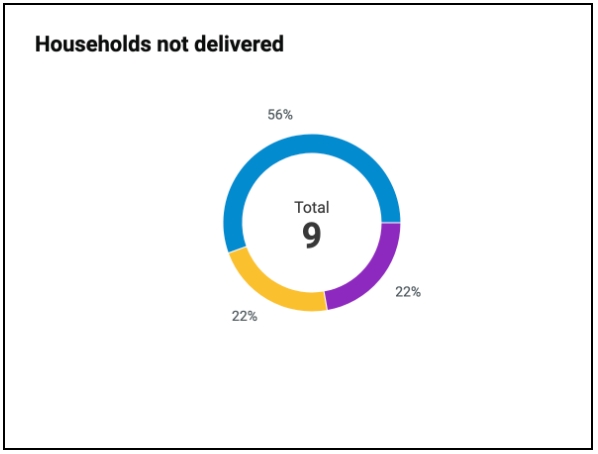
The pie chart component can be made to display the cumulative value in the centre of the chart based on the “showLabel” config field set for pie charts.
Set the “showLabel” field for a pie chart (ChartApiConfig.json) to ‘true’ to enable the label.
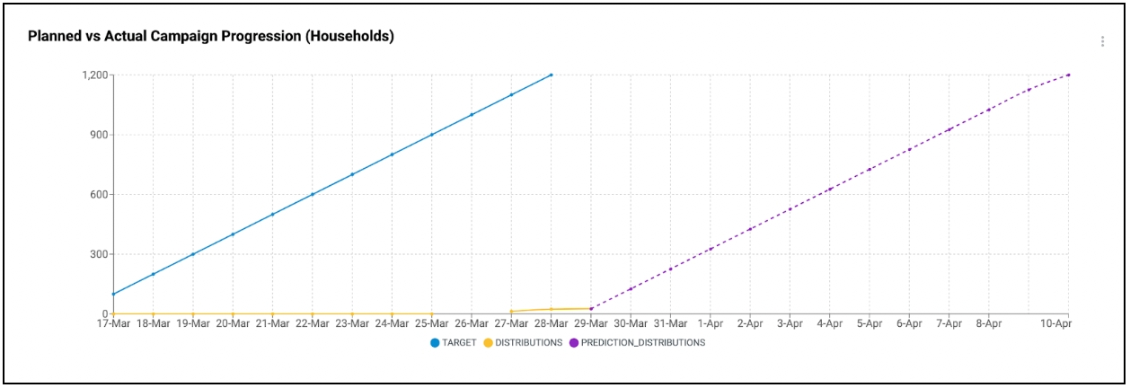
The line chart can be configured to display future projections based on the existing data set by enabling a configuration field in the respective chart configuration.
Set the “predictionPath” field in the line chart configuration to point to a specific aggregation path from which the prediction data needs to be calculated. If the “predictionPath” is not available for a line chart, then the prediction will be skipped for the respective chart.
The table chart can be configured to display a footer row at the bottom to show the cumulative total of the row values for all columns with numeric values. Percentages and non-numeric values will not be included in the total value.
Set the “showFooter” field in the line chart configuration to ‘true’. This will enable the footer row for the respective table chart.
The charts can be configured to filter the data only for the current day without hard-coding the date range in the aggregation query.
Set the “filterForCurrentDay” field in the line chart configuration to ‘true’. This will override the date range in the backend and filter only the data that are inserted for the current day.
Line charts can be configured to display percentages calculated based on the results from two aggregation paths.
Ensure that there are exactly two aggregation queries.
The result from the first query will be used as the numerator and the second result set will be used as the denominator for the percentage calculation.
Set ‘percentage’ as the value of the ‘action’ field in the chart configuration.
Line charts can be configured to divide one dataset by another to calculate the quotient value.
Example: This is used in the inventory chart on the health dashboard to calculate the number of days the stock will last in an inventory by dividing the existing count by the target value.
Ensure that there are exactly two aggregation queries .
The result from the first query will be used as the numerator and the second result set will be used as the denominator to calculate the quotient.
Set ‘division’ as the value of the ‘action’ field in the chart configuration.
Line charts can be configured to calculate the sum of two aggregated datasets returned by the aggregation queries.
Example: This is used in the inventory chart that displays the number of stocks that are available in hand by calculating the sum of the incoming stocks.
Ensure that there is more than one aggregation query preset to calculate the sum.
Mention the “actionName” as “SumComputedField” within the chart’s computedFields.
Include the aggregation paths that are required to calculate the sum.
Line charts can be configured to perform the division on a bucket of data by a constant value. This can be used to calculate the percentage share of individual bucket items by comparing with the total sum of data.
Example: This is used in the complaints chart which displays the district-wise share of complaints by comparing against the overall number of complaints registered for the entire province.
Ensure that there are exactly two aggregation queries. The first should return the aggregation results in a bucket. The second result should be the sum of the values.
Set “divisionbyconstant” as the value of the ‘action’ field.
Line charts do not retain the original sort order after performing the computation. Using the sort action, the computed results can be sorted based on the bucket keys or values in both ascending and descending order.
The “computedFields” object accepts the ‘sort’ field and the value should denote the order of the sorting expected.
The ‘sort’ field accepts four values:
- sortValueAsc: To sort based on the increasing order of the values.
- sortValueDesc: To sort based on the decreasing order of the values.
- sortKeyAsc: To sort based on the increasing order of the keys.
- sortKeyDesc: To sort based on the decreasing order of the keys.
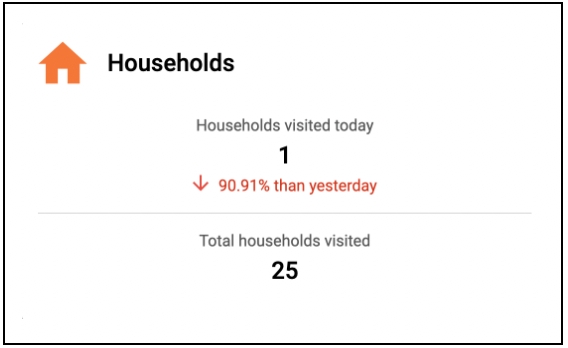
Enabling insights’ calculation based on the day shows the comparison between the current day’s data and the previous day’s data.
Setting the ‘interval’ field to ‘day’ inside the ‘insight’ object will enable day-wise insight calculation
The date range selected for fetching the data should not be more than a single day to calculate day-wise insights.
Enabling Insights calculation for a date range shows the comparison between the Data from (project start date to the current date) and (project start date to the previous day).
Setting the ‘insightInterval’ field to “dateRange” inside the “insight” object will enable date-range insight calculation.
The date range Insight interval can be applied only for date ranges more than one day.
Field
Description
Campaign name
Name of the campaign.
Event type
Type of event where attendance is done, that is training or distribution.
Start date
Start date of the campaign.
End date
End date of the campaign.
Status
If the end date is passed, the status will be inactive, or if the register status is inactive, the status will be inactive, else, the status will be active.
Staff count
Number of attendees in the register.
Attendance completion
Shows the number of days for which attendance has been submitted submitted to the server.
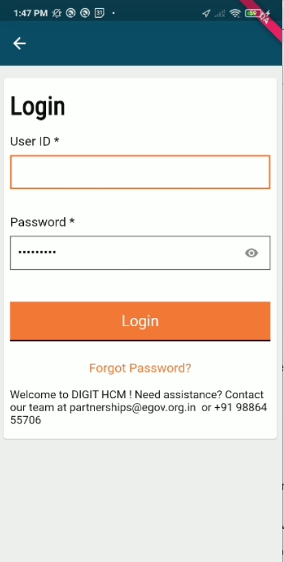
Users are redirected to this screen once they select the preferred language in the previous screen.
On this page, the following actions can be performed:
A user can log in to the app by giving the User ID and Password.
The "Forgot Password" button gives a user the option to contact the administrator to reset if he/she has forgotten the password.
Login Screen
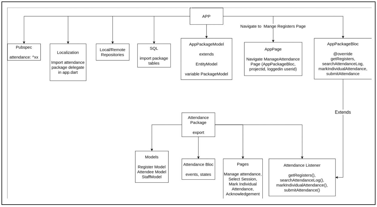
Below is the diagram of the components that are there in the HCM App and attendance package, and how the interaction happens:
Add attendance package dependency in pubspec.
Create a bloc that extends the attendance listener class and creates the override methods.
Create model classes that import attendance models and add companion class.
Create repositories local and remote as per project requirements and structure.
Add typedef for repositories in untils/typedef.
Initialise repo in network manager, and create oplog.
Create SQL tables in case of offline.
Add navigation to manage the attendance page from the HCM app, and pass the required fields.
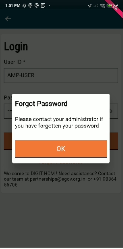
Users are redirected to this screen once they click on the "Forgot Password" button in the language selection screen.
On this page, the following actions can be performed:
Clicking on the forgot password option in the login page opens a popup message “Please contact your administrator if you have forgotten your password”.
Forgot Password Dialog
Digit Dialog :
Input Field :
Notification SnackBar:
Elevated Button:
