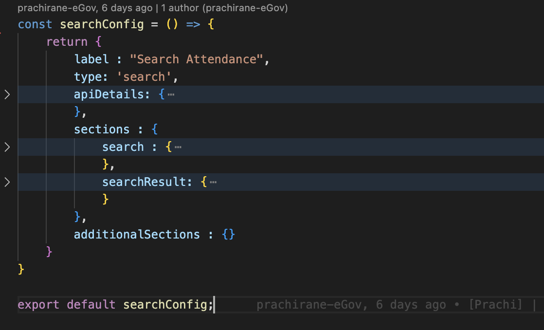
base search config
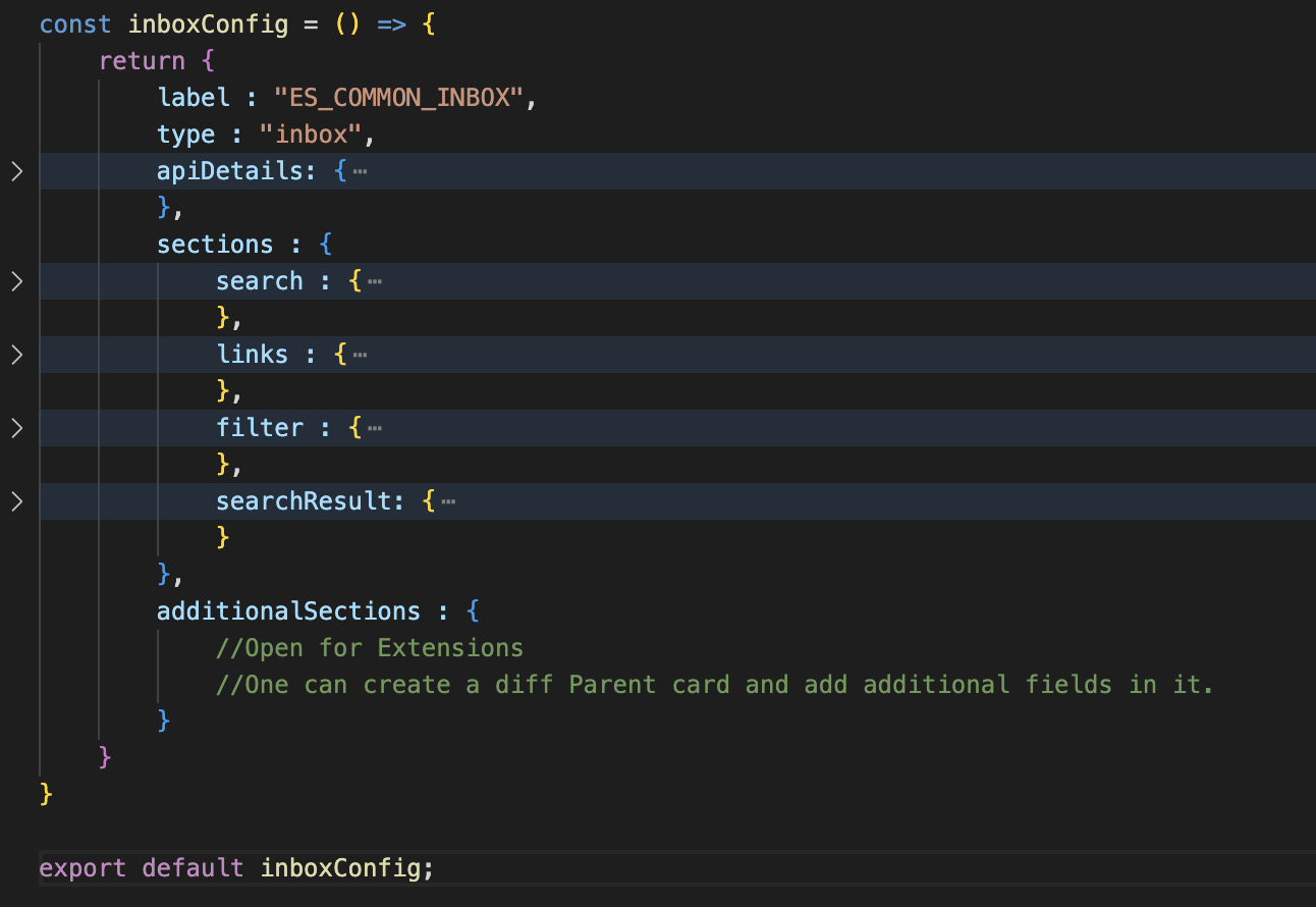
Base Inbox config

Api details section
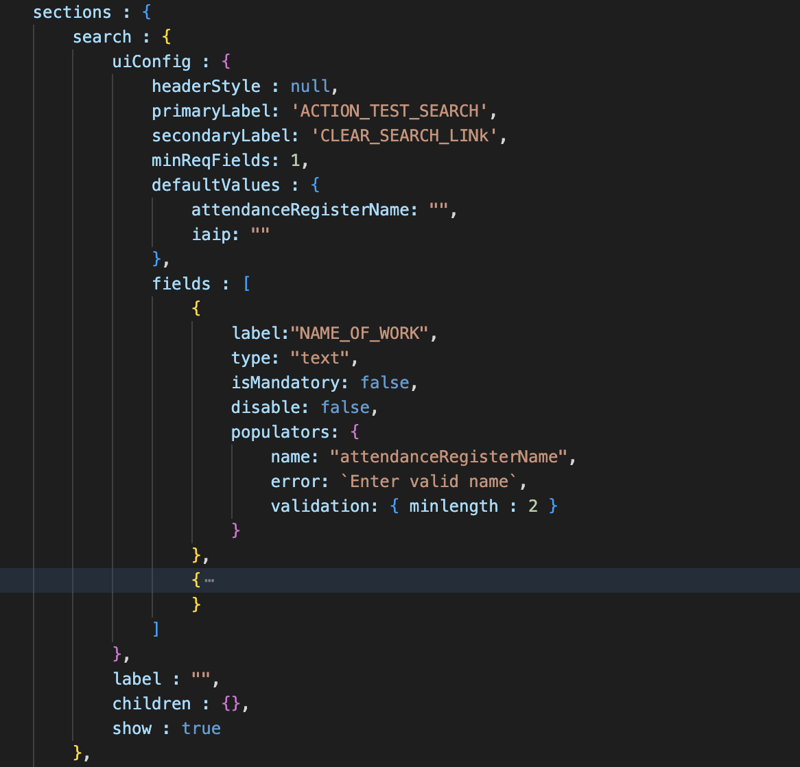
search
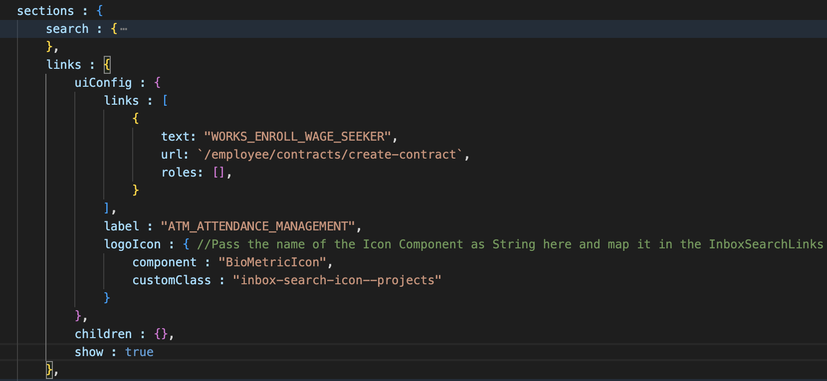
Links
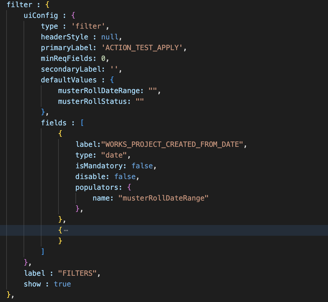
Filter section
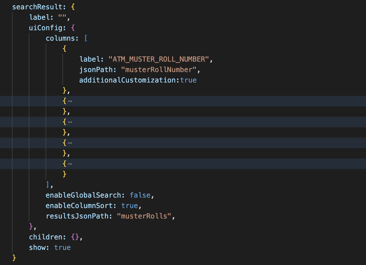
Results Table
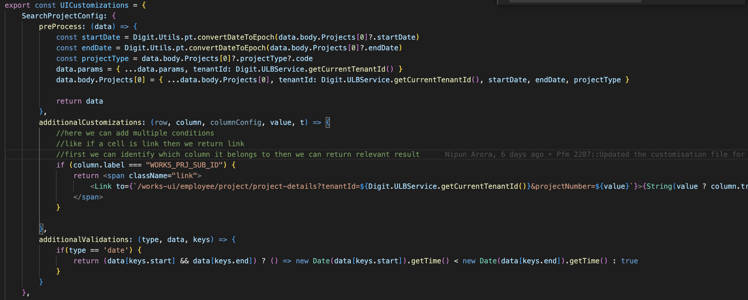
Ui customisations for Search project screen

Sample code for project search page
| Prop Name | Description | |
|---|---|---|
| configs | Config fetched from MDMS data |
| Prop Name | Description | |
|---|---|---|
| headerText | Config fetched from MDMS data | |
| links | Links to navigate to other screens | |
| customClass | Class to update styling | |
| logoIcon | Icon name and class to render in component |
| Prop Name | Description | |
|---|---|---|
| uiConfig | Config to render search/filter form | |
| header | Title of form | |
| screenType | Type of parent screen, can be either ‘inbox’ or ‘search’ | |
| fullConfig | Entire config of screen which also includes API details |
| Prop Name | Description | |
|---|---|---|
| config | Config to render table | |
| data | Search results need to be populated in table | |
| isLoading | Flag to pass to handle loading state | |
| isFetching | Flag to pass to handle loading state | |
| fullConfig | Entire config of screen which also includes API details |
| Prop Name | Description | |
|---|---|---|
| fields | Config to render all form fields | |
| control, formData, errors, register, setValue, getValues, setError, clearErrors | Props to handle all form actions like collectibe data, setting errors, clearing errors etc. | |
| apiDetails | Includes all API details required to fetch data |
base search config
Base Inbox config
Api details section
search
Links
Filter section
Results Table
Ui customisations for Search project screen
Sample code for project search page