SMC Dashboard User Manual
Steps
Enter the dashboard URL in the browser.
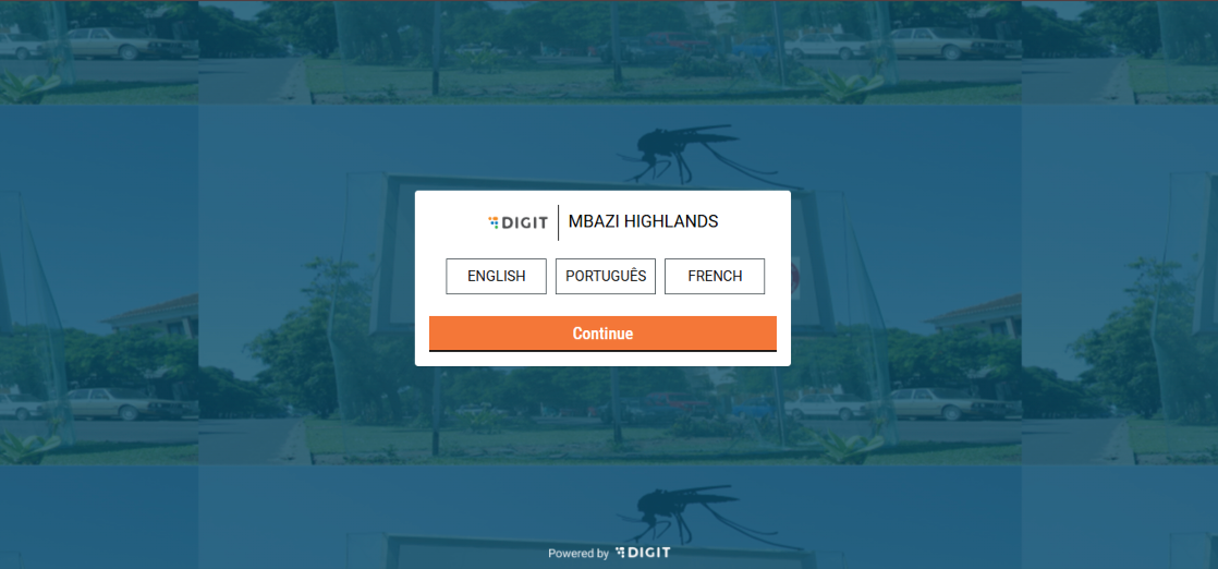
On the language selection screen, choose your preferred language and click Continue.
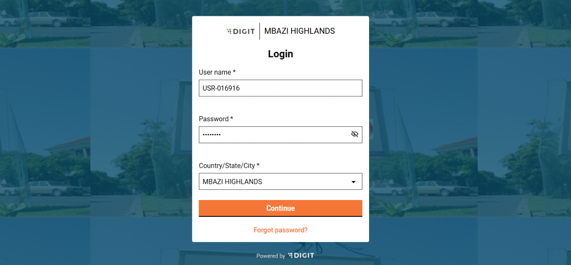
Enter your credentials on the Login page and click Continue to access the dashboard.
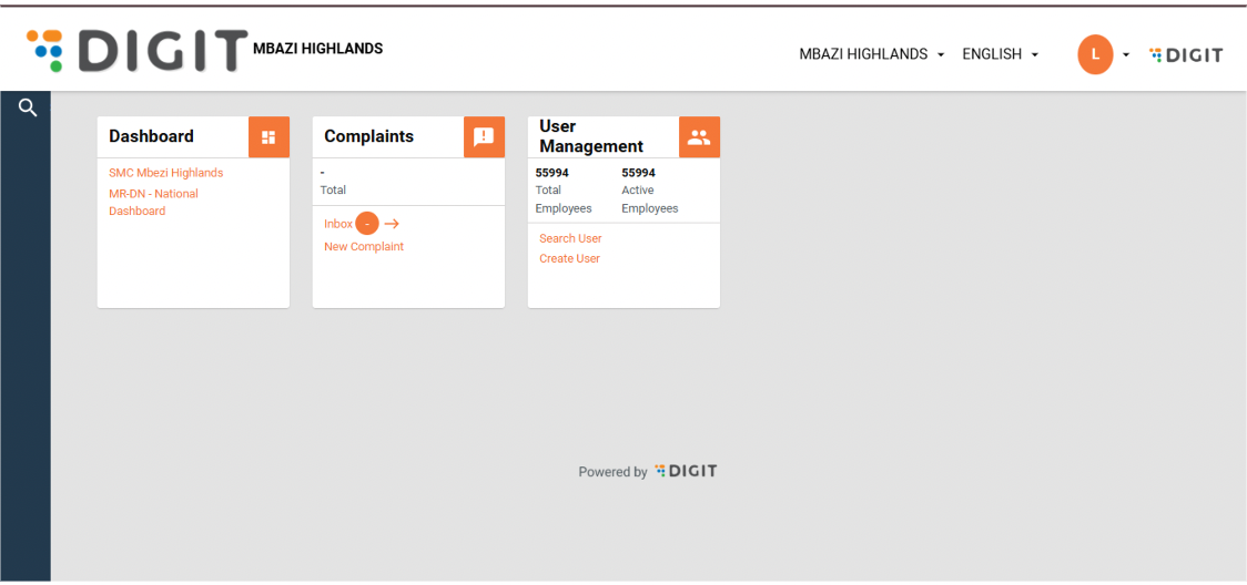
The home page lists the campaign dashboards.
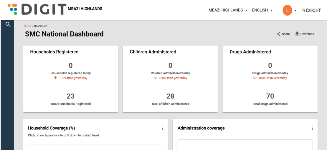
Click on the Dashboard. If you are logged in as a National Supervisor, the landing page shows the national overview page.
To navigate to a sub-national level dashboard, click on the View Dashboard button next to the sub-national boundary name.

Modules
The dashboard is divided into several tabs based on campaign modules: Registration & Delivery, Inventory, Complaints, Supervision, Team Performance, Data Quality, and Referral and Side Effects.
Features
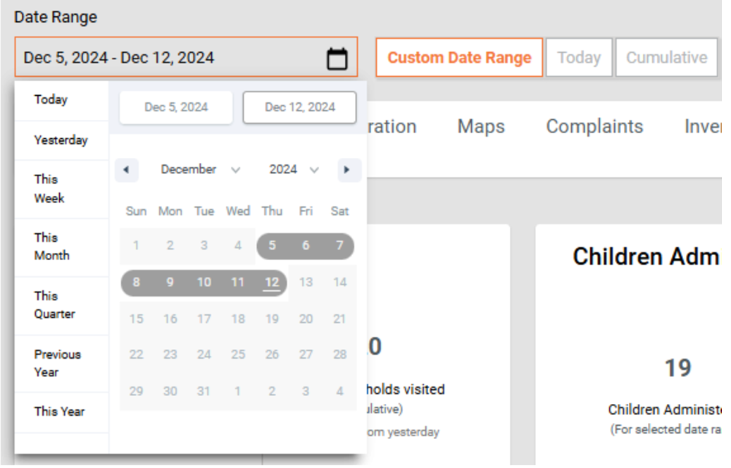
Date Filters
Each page includes date filter options to view campaign data:
Specific Date Range – Select start and end dates.
Today’s Data – View data recorded for the current day.
Cumulative Data – View data accumulated since the start of the campaign.
Campaign Progress
At the top of each page, a progression line shows the number of days since the campaign started.
Use this to quickly track the campaign’s timeline and progress.

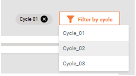
Filter By Cycle
Use the Filter by Cycle option to view data for a specific treatment cycle in the Seasonal Malaria Chemoprevention (SMC) campaign.
Since children receive treatment across multiple cycles, this filter allows you to:
Focus on performance and coverage for a particular cycle
Track progress and identify gaps in the campaign
Drill-Down Bar Charts
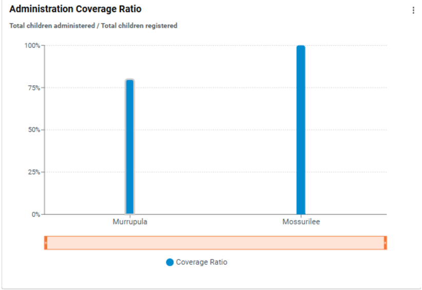
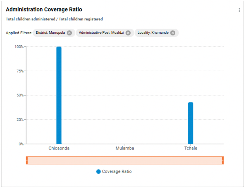
Click on any bar in the chart to drill down into sub-boundaries.
Continue drilling down until you reach the lowest level (e.g., a village).
To return to the previous view, click the '×' button.
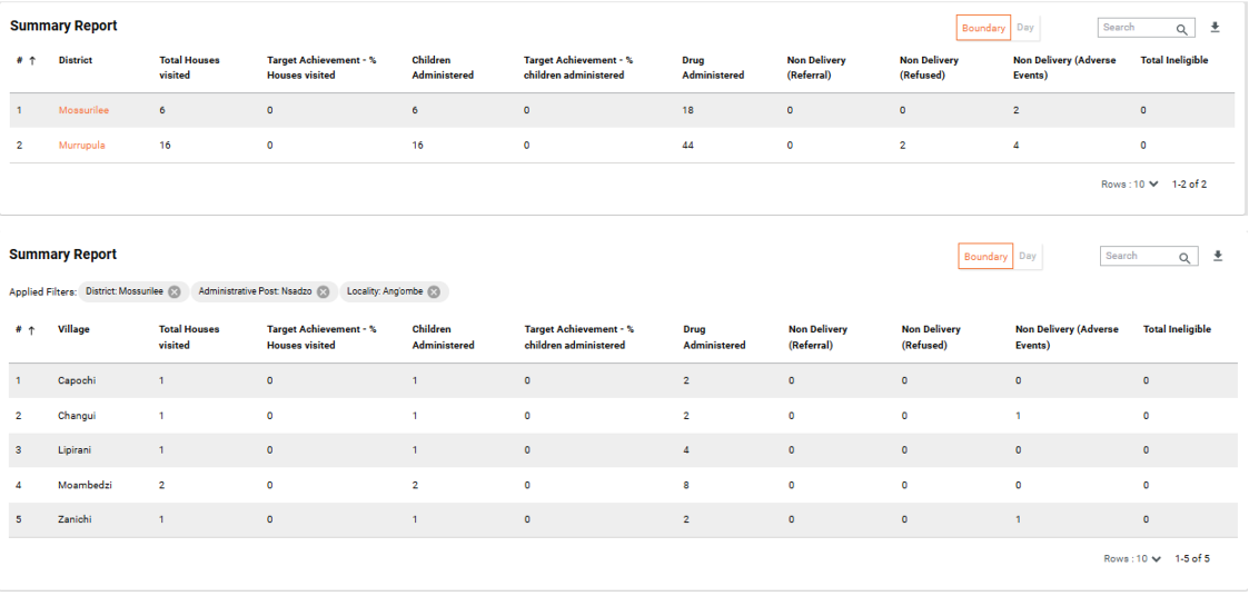
Drill-Down Table Charts
Click on any boundary in the table to drill down into sub-boundaries.
Continue drilling down until you reach the lowest level (e.g., a village).
To return to the previous view, click the '×' button.
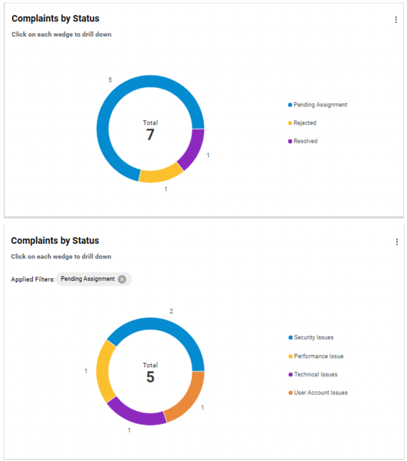
Drill-Down Pie Charts
Click on any slice in the pie chart to drill down into sub-categories or data split across sub-boundaries.
To return to the previous view, click the '×' button.
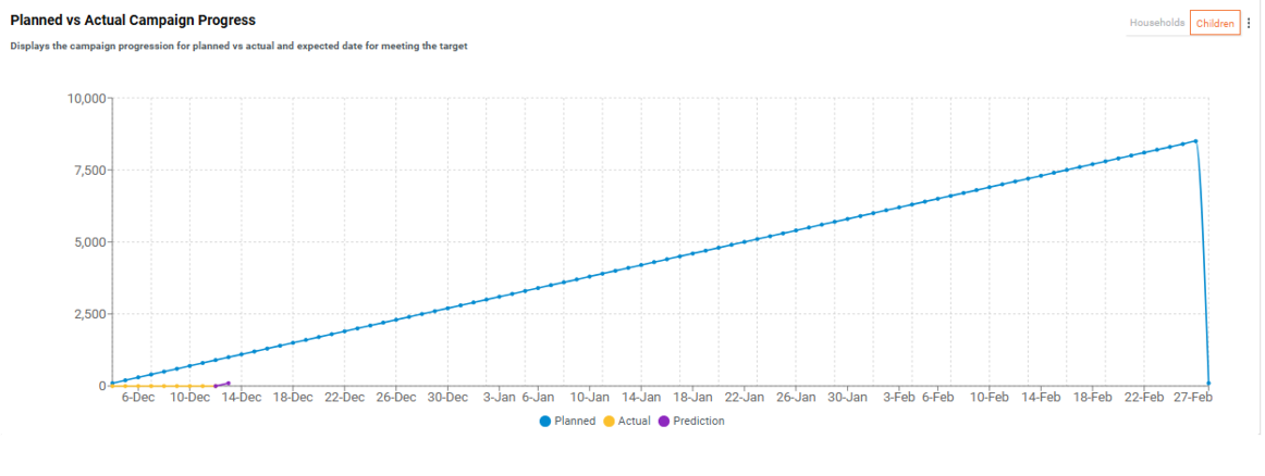
Prediction Line Chart
The Prediction Line Chart estimates the number of additional days required to reach the target coverage.
This estimate is based on the current service delivery rates, helping to plan and adjust campaign efforts.
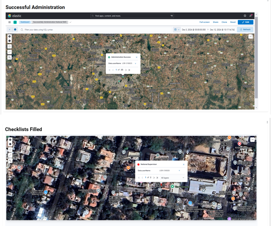
Geocoordinate Maps
The system uses geographic coordinates from completed checklists to monitor:
Distributor coverage
Supervisor performance
On a zoomed-out map, coordinates are grouped into clusters for easier viewing.
Click on a cluster to see details, including:
Total number of points in the cluster
Information about the supervisors who recorded the data
This allows users to track performance and coverage across different areas efficiently.
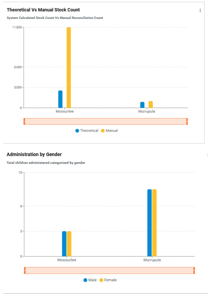
Side-by-Side Comparative Bar Charts (2 Variables)
Purpose: These charts allow a clear comparison between two distinct variables, making it easier to identify differences and trends.
Use Cases:
Compare coverage by gender relative to population distribution.
Compare expected stock levels vs. actual stock balance.
Benefits:
Provides a clear view of inventory management.
Helps supervisors identify discrepancies, such as potential shortages or overstocking, ensuring campaign needs are met.
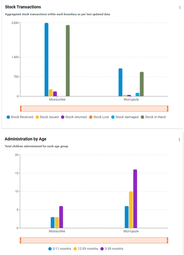
Side-by-Side Bar Charts (More Than 2 Variables)
Purpose: Display multiple relevant variables simultaneously in a single chart for comprehensive analysis.
Use Cases:
Compare age categories
Analyse referral summaries
Track stock movements
Benefits:
Enables supervisors to compare and analyse data across different dimensions quickly.
Facilitates faster identification of trends, patterns, or areas requiring attention.
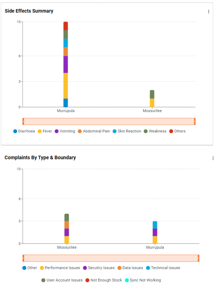
Stacked Bar Charts
Purpose: Stacked bar charts visualise the distribution of data across multiple variables, enabling easy comparison and analysis.
Use Cases:
Display the number of complaints filed within each operational boundary (e.g., district), grouped by type or status (pending, resolved, rejected).
Show types of side effects recorded during a campaign, with categories stacked vertically for each boundary.
Benefits:
Easily identify trends and compare performance across regions or cycles.
Pinpoint areas requiring further attention or intervention.
Provides a clear comparative view to support data-driven decisions and enhance campaign efficiency.
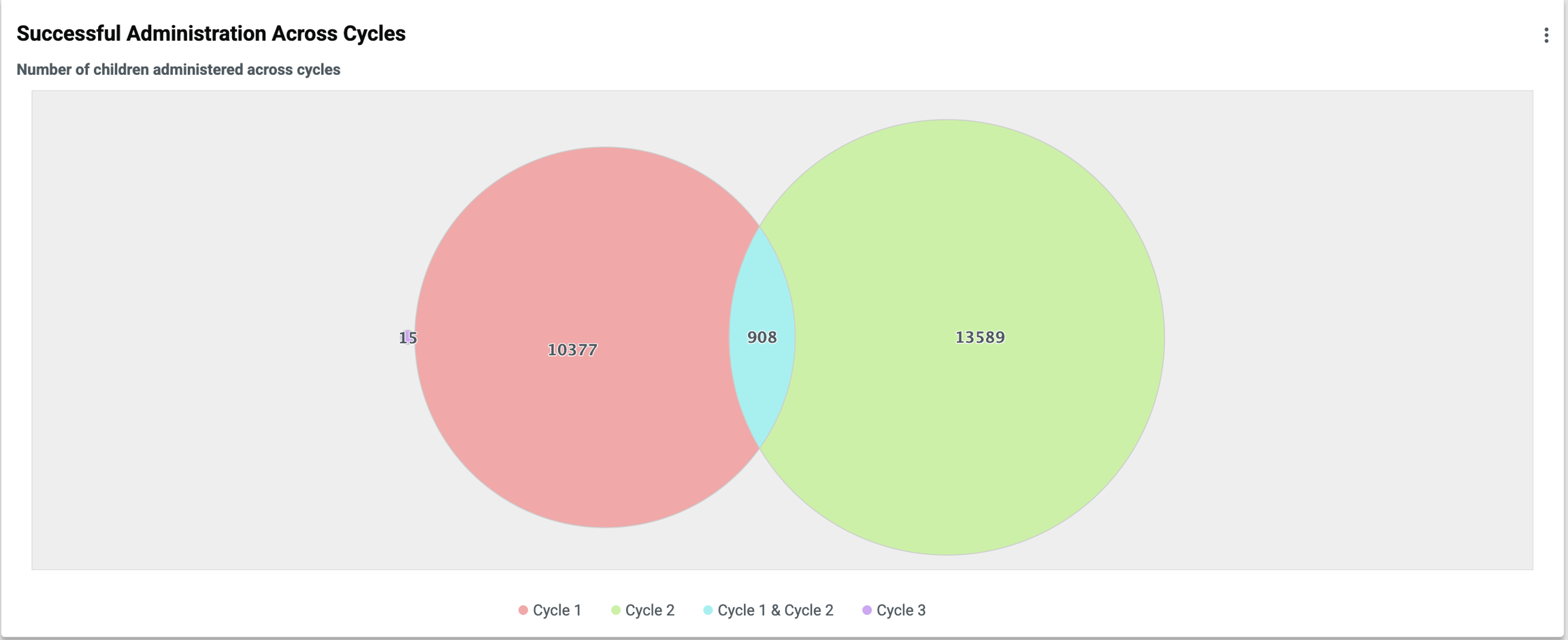
Venn Diagram for Inter-Cycle Analysis
Purpose: The Venn diagram visually represents the overlap and distribution of children treated across different campaign cycles.
Details Displayed:
Cycle 1: Children treated in the first cycle
Cycle 2: Children treated in the second cycle
Overlap: Children who received treatment in both cycles
Benefits:
Identify the extent of coverage across cycles
Ensure children needing multiple rounds of treatment are accounted for
Highlight treatment gaps and overlaps to support efficient campaign management and decision-making
Was this helpful?